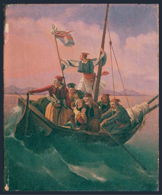
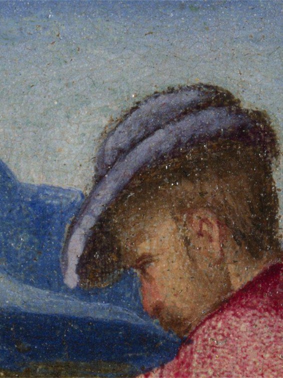
Boat of Greeks, 1844 to 1847, oil on canvas, 29×23 cm, Averoff Museum, Metsovo, Greece
https://www.averoffmuseum.gr/boat-of-greeks/?lang=en
“…Fill high the bowl with Samian wine! / On Suli’s rock, and Parga’s shore, / Exists the remnant of a line / Such as the Doric mothers bore; / And there, perhaps, some seed is sown, / The Heracleidan blood might own. / Trust not for freedom to the Franks— / They have a king who buys and sells; / In native swords and native ranks / The only hope of courage dwells: / But Turkish force and Latin fraud / Would break your shield, however broad….” Writes George Gordon Byron in The Isles of Greece and makes the best possible introduction for Dionysis Tsokos’s Boat of Geeks at the Averoff Museum in Metsovo. https://englishverse.com/poems/the_isles_of_greece
Dionysis Tsokos’s painting Boat of Geeks is closely connected to the fate of the small city of Parga on the Ionian Coast of Epirus. Parga, a small city/fortress, was always closely connected to the European political interests of the Ionian Islands. Since 1360 when the fortress of Parga was built with the help of the Normans who held, at the time the island of Corfu, the Pargians faced countless Ottoman attacks while they were under Venetian, French or British rule. In 1815 the inhabitants of the city of Parga rebelled against the French rule, under the instigation of the British, and a short period of British rule started. Seeing Parga as the stepping stone to achieving their final goal: to occupy the Ionian Islands, the British, in 1817, sold Parga to Ali Pasha for 150,000 pounds. https://www.kastra.eu/castleen.php?kastro=parga
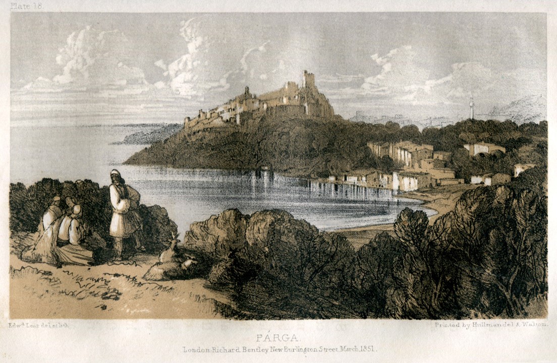
Parga, Journals of a Landscape painter in Albania etc., London, Richard Bentley, 1851, 14×21 cm, Benaki Museum Library
https://eng.travelogues.gr/collection.php?view=283
What happened next is best described in the October 1819 edition of the Edinburgh Review… “As soon as the notice was given [of how much Ali was to be charged for their homeland] every family marched solemnly out of its dwelling, without tears or lamentation; and the men, preceded by their priests, and followed by their sons, proceeded to the sepulchres of their fathers, and silently unearthed and collected their remains, – which they placed upon a huge pile of wood which they had previously erected before one of their churches. They even took their arms in their hands, and, setting fire to the pile, stood motionless and silent around it, till the whole was consumed. During this melancholy ceremony, some of Ali’s troops, impatient for possession, approached the gates of the town; upon which a deputation of citizens was sent to inform our Governor, that if a single Infidel was admitted before the remains of their ancestors were secured from profanation, and they themselves, with their families, fairly embarked, they would all instantly put to death their wives and children, – and die with their arms in their hands, – and not without a bloody revenge on those who had bought and sold their country. Such a remonstrance, at such a moment, was felt and respected, as it ought by those to whom it was addressed. General Adam succeeded in stopping the march of the Mussulmans. The pile burnt out – and the people embarked in silence…” http://newsteadabbeybyronsociety.org/works/downloads/sale_parga.pdf and https://books.google.gr/books?id=7kNBAAAAYAAJ&pg=RA1-PA12&lpg=RA1-PA12&dq=Edinburgh+Review+Sale+of+Parga&source=bl&ots=hZxwnxM1hD&sig=ACfU3U3ac4JXKloQ18zhWLsbpAsGjXXTtQ&hl=el&sa=X&ved=2ahUKEwjug-2Ly5jvAhVfQhUIHaLnBgkQ6AEwB3oECAkQAw#v=onepage&q=Edinburgh%20Review%20Sale%20of%20Parga&f=false pp. 22-23
Boat of Geeks by Dionysis Tsokos depicts the final act of Parga’s sale by the British to Ali Pasha… “a boat full of refugees – resistance fighters, a priest, and a woman – floundering on the waves as it heads for foreign shores. One gallant lad stands embracing the mast and holding the Greek flag, gazing intently at the fatherland he is abandoning, while the captain holds fast to the helm.” https://www.averoffmuseum.gr/boat-of-greeks/?lang=en
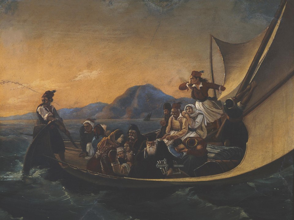
The Flight from Parga, after 1847, oil on canvas, 37×47 cm, E. Koutlidis Foundation Collection, National Gallery of Greece, Athens
https://www.nationalgallery.gr/en/painting-permanent-exhibition/painting/the-years-of-othon%E2%80%99s-reign/history-painting/the-flight-from-parga.html
Dionysis Tsokos created two paintings on the theme of Greeks fleeing Parga after the shocking 1819 British sale to Ali Pasha. The earliest, chronologically, of the two paintings, is today exhibited in the Averoff Museum at Metsovo, one of my favourite Art Museums in Greece, the second painting, dated a little later is part of the E. Koutlidis Collection and is exhibited in Athens at the National Gallery. For a Student “Compare and Contrast” Activity on Dionysis Tsokos’s paintings, please… Check HERE!
If you wish to learn more about the Greek War of Independence and the Bicentennial Celebrations in 2021, please VISIT the official Greece 1821-2021 Bicentennial site http://www.greece2021.gr, Twitter, https://twitter.com/Greece_2021, Facebook, https://www.facebook.com/Greece2021/, and Instagram, https://www.instagram.com/greece2021/?hl=el