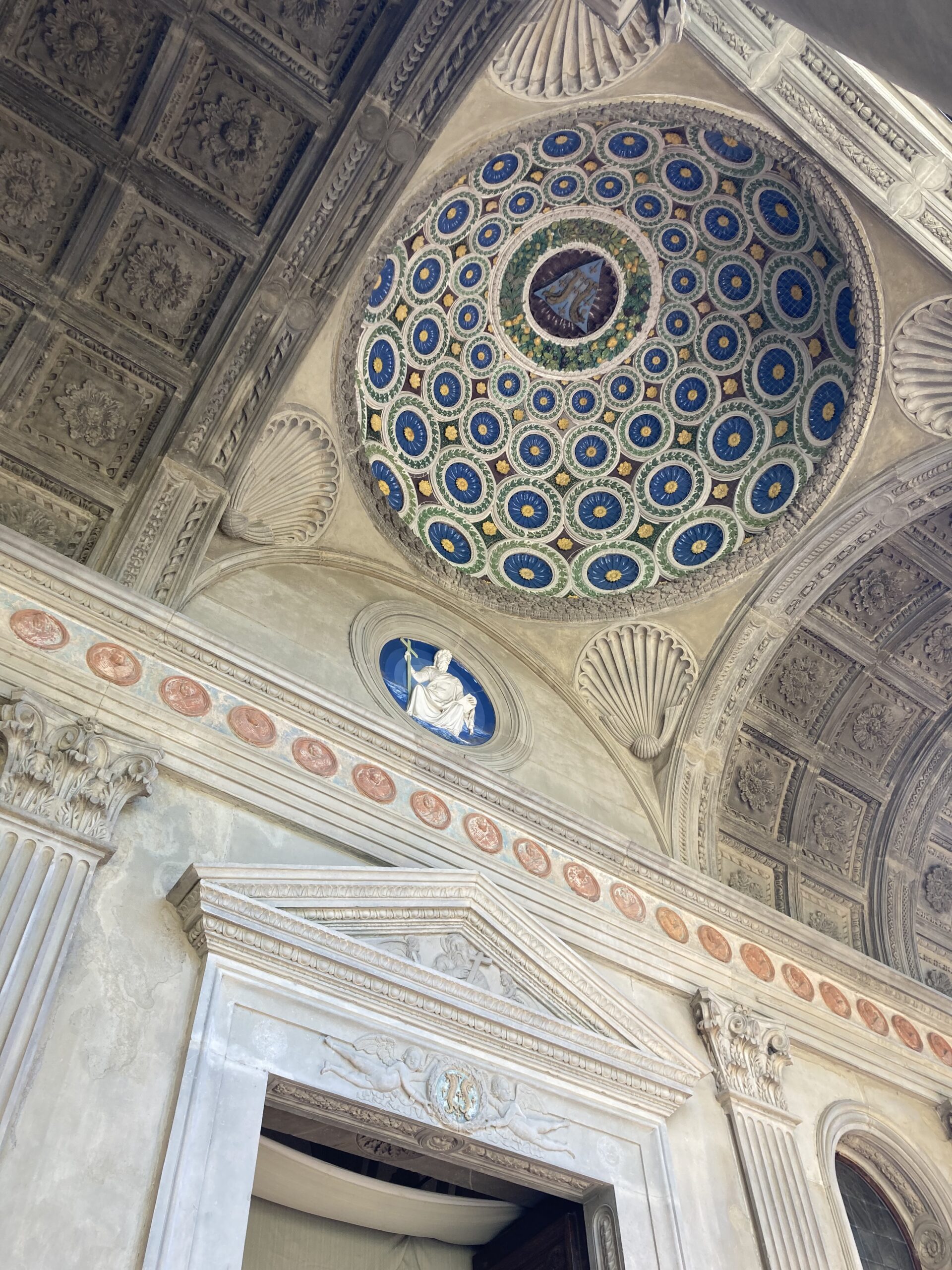
Luca della Robbia’s glazed terracotta dome in the Pazzi Chapel combines Renaissance geometry, luminous colour, and the Pazzi coat of arms in a striking architectural and symbolic program.
Luca della Robbia’s glazed terracotta dome in the Pazzi Chapel combines Renaissance geometry, luminous colour, and the Pazzi coat of arms in a striking architectural and symbolic program.
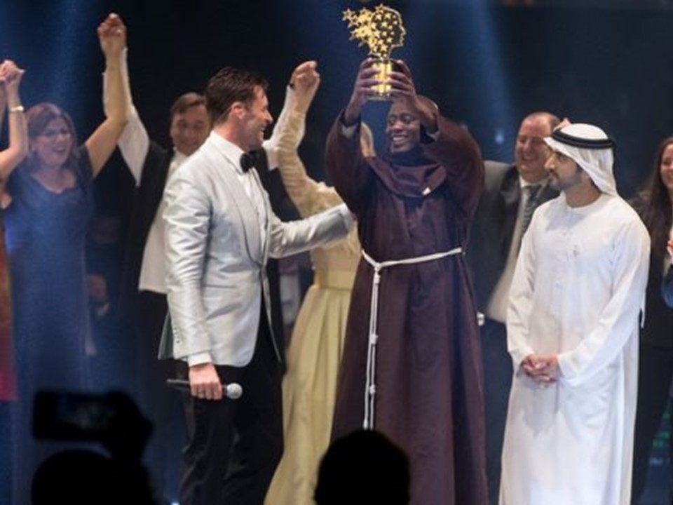
Brother Peter Tabichi’s passion for education in Kenya inspires reflection on teaching values, reminding us true learning is rooted in care, vision, and commitment to students’ futures.