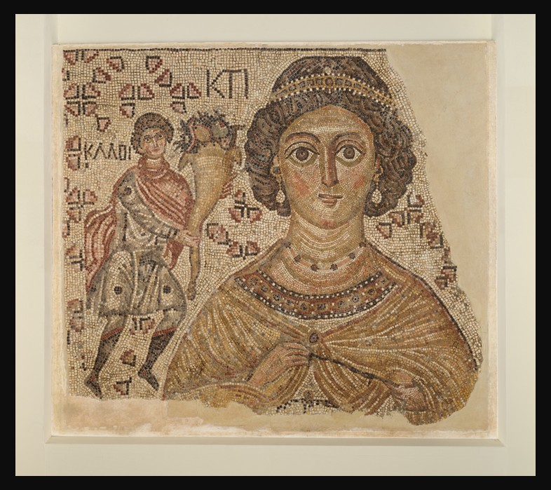
The first day of spring, March 20, 2026, arrives as it always has — quietly, persistently, with light lingering a little longer and the earth stirring back to life. Across cultures and centuries, this moment has marked renewal, balance, and the return of growth. Fittingly, an ancient work of art from the island of Lesvos captures this same eternal rhythm: the remarkable Roman mosaic from the House of Euripos, now displayed in the Archaeological Museum of Mytilene, Greece.
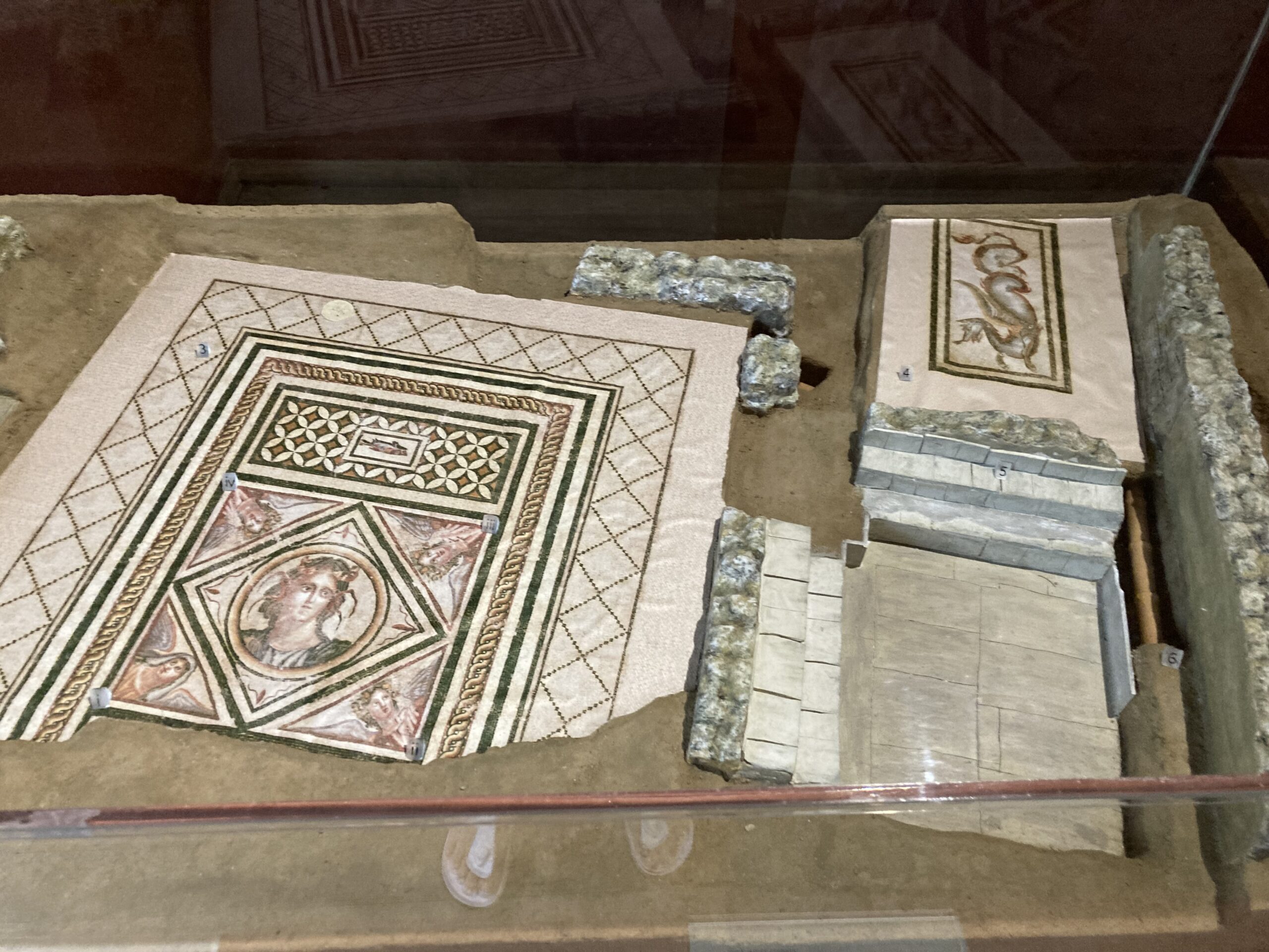
Created in the 2nd–3rd century AD, this mosaic once decorated the atrium of a grand Roman house on the hill of Agia Kyriaki. Like other elite homes of its time, the structure was likely organized around a sun-lit courtyard with rooms opening onto it, spaces for welcoming guests, sharing meals, and everyday family life, all designed to make the most of light and air. Interestingly, the natural slope of the land made space for an underground stone cistern with an arched roof, neatly built into the structure. But it’s the Roman mosaic floor that truly steals the show, turning the setting from simply elegant into something memorable, with imagery that reflects the powerful forces shaping both nature and everyday human life.
The Mosaic of the Four Seasons
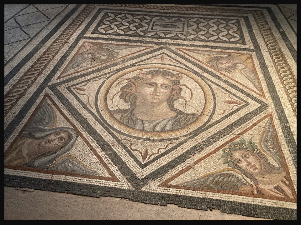
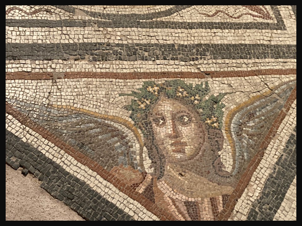
At its center appears a striking figure: a young, beardless sea spirit, framed within a medallion set inside a diamond shape. His identity is closely tied to the waters that sustained ancient Mytilene. Scholars interpret him as Euripos, representing either a key waterway near the city or the Pyrrhaean Euripos, today’s Gulf of Kalloni, famed since antiquity for its rich fisheries. His marine nature is unmistakable: dolphins and lobster claws woven into his hair signal his dominion over the sea. He is not merely decorative; he embodies abundance, movement, and the life-giving power of water, a reminder that prosperity in island communities has always depended on the rhythms of the natural world.
Surrounding this central sea being, at the four corners of the diamond, are the Four Seasons, shown as winged figures, both male and female, each with distinct attributes. Together they form a complete cycle of the year, a cosmic calendar in stone. Spring, the season we celebrate today, is depicted with flowers and fresh green leaves, symbols of rebirth and vitality. Her presence radiates softness and promise, much like the first blossoms that now dot fields and gardens. Summer holds sheaves of grain, a sign of harvest to come and the sun’s nurturing strength. Autumn bears fruits, representing maturity, fulfillment, and the rewards of the earth. Winter, in contrast, appears with a somber expression and wrapped in heavy drapery, embodying cold, stillness, and the dormancy from which life will soon re-emerge.
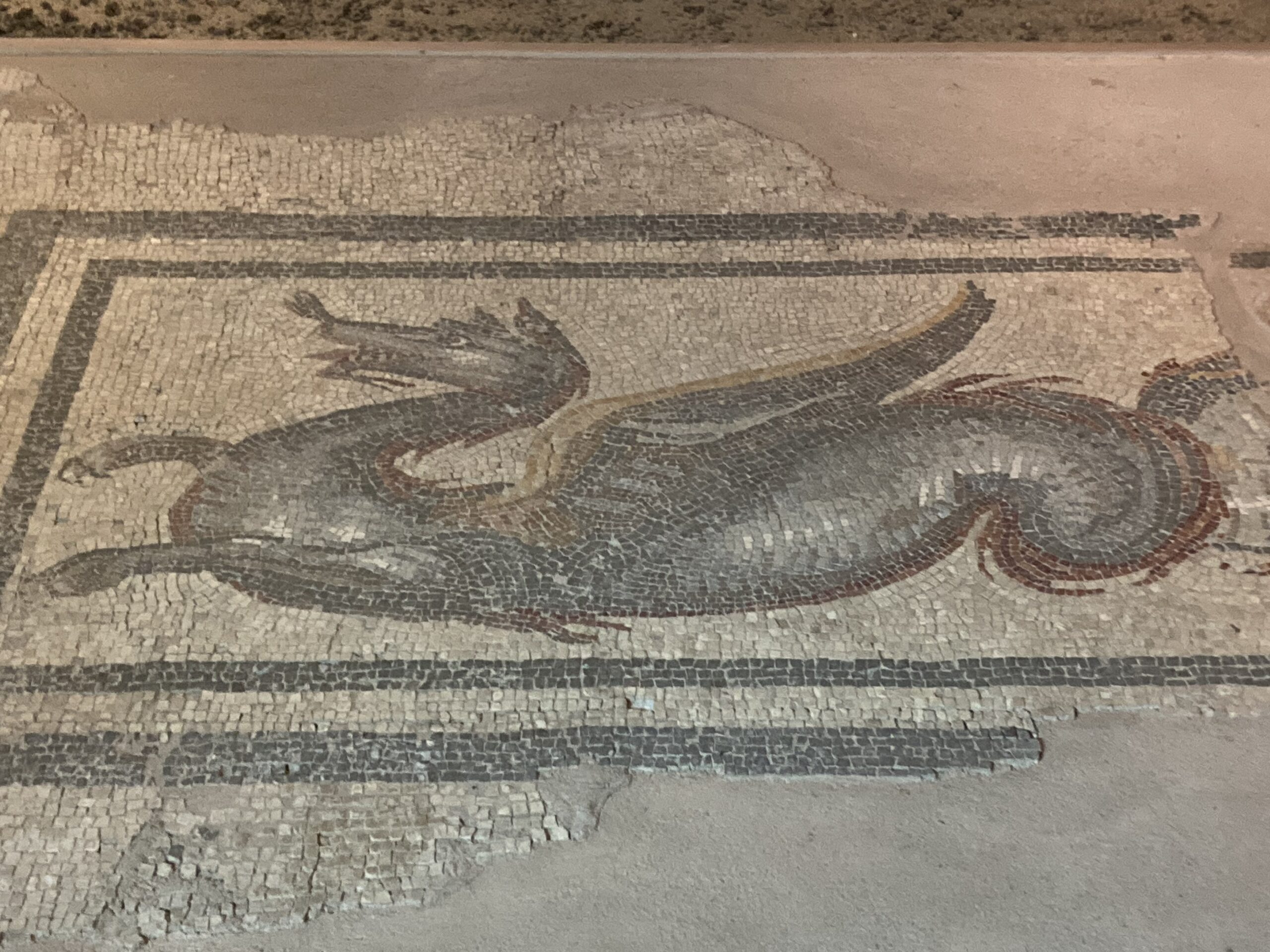
Together, these figures do more than decorate a floor, they express an ancient understanding of time as a cycle rather than a straight line. The people who walked across this mosaic nearly two thousand years ago lived in close awareness of seasonal change. Agriculture, fishing, travel, and daily routines all depended on nature’s shifting moods. By placing the Seasons around a sea divinity, the mosaic’s artist wove land, water, and time into a unified vision of existence. Even the guardian dragon once positioned at the entrance of the house fits within this worldview. Fierce and protective, it symbolically stood watch over the household, guarding the harmony between the human domain and the powerful natural and supernatural forces represented inside.
Artistically, the mosaic from the House of Euripus is a masterpiece of subtlety. The creator employed delicate shades of gray, pink, green, and yellow, achieving depth and liveliness with remarkable sensitivity. Though made in the Roman period, the style reflects the enduring influence of the rich Hellenistic artistic tradition, a blend of technical skill and emotional nuance that gives the figures both grace and presence. On this first day of spring, the mosaic feels especially resonant. Spring’s figure in the composition does not stand alone; she exists as part of a greater cycle that includes growth, abundance, decline, and rest. The message is timeless: renewal is meaningful because it follows dormancy. Light returns because darkness had its turn.
As we step into longer days and warmer air, the Roman Mosaic from the House of Euripos reminds us that the changing seasons have always shaped human imagination. Nearly two millennia ago, an artist in Mytilene, Greece captured the same sense of wonder we feel today when the first flowers open. Stone and tesserae preserve that moment for us, a quiet but enduring celebration of nature’s rhythms and the promise carried in every new spring.
For a PowerPoint presentation of the Roman Mosaic from the House of Euripos mosaic in Mytilene, please, check… HERE!
The House of Euripos is not an isolated example. Roman Mytilene was home to a number of richly decorated villas, including the House of Menander, whose extraordinary mosaics, featuring theatrical scenes, philosophers, and mythological imagery, offer a fascinating parallel to the artistic and cultural world reflected here. Together, these residences reveal the prosperity and refined tastes of the island during the Roman period. Read more about the House of Menander
Bibliography: from the Lesvos News https://www.lesvosnews.net/articles/news-categories/afieromata/ti-na-deite-sto-arhaiologiko-moyseio-mytilinis-grafei-o and the site of the new Archaeological Museum of Mytilene https://archaeologicalmuseums.gr/en/museum/5df34af3deca5e2d79e8c122/new-archaeological-museum-of-mytilini