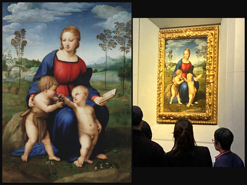
Hephaistia on the island of Lemnos

Ancient Theater of Hephaistia, late 5th to early 4th century BC, Lemnos Island, Greece
One of the most important monuments of Lemnos, this theater reflects the transition from the Classical to the Hellenistic world, later remodeled during the Roman period.
Photo Credit: Amalia Spiliakou, July 2025

When I visited the ancient city of Hephaistia on the island of Lemnos in July 2025, the quiet hills and open sea breeze made it easy to imagine how myth and daily life once blended here. Named after Hephaestus, the god of fire and metallurgy who, according to legend, fell to Lemnos after being cast from Olympus, the city was the island’s principal center of power and worship. Today its ruins still speak volumes: the stone outlines of sanctuaries and houses, the tombs that reveal centuries of life, and the well-preserved theater that once echoed with civic gatherings and performances. To walk through Hephaistia is not only to step into a serene landscape but also to encounter a city that thrived from the Late Bronze Age through the Byzantine era, balancing myth, religion, and community in a way that remains profoundly compelling.

Hephaistia was once the most important city of Lemnos, rivaling the nearby settlement of Myrina. Its strategic position overlooking the northern Aegean not only provided natural protection but also allowed it to thrive as a gateway for trade, culture, and religious influence. It became both a political hub, where decisions shaping the island were made, and a sacred site intimately tied to the cult of Hephaestus, whose fiery craft was thought to resonate with the island’s volcanic landscape. Archaeological discoveries confirm continuous habitation for centuries, revealing a layered history of prosperity and resilience. The diversity of remains — from private homes and storerooms to public baths, temples, and meeting spaces — paints a picture of a bustling, interconnected community. Hephaistia was not merely a seat of power but also a place where religious rituals, artistic performances, and everyday exchanges intertwined, embodying the rhythms of civic life in antiquity.

The site’s most striking feature is its ancient theater, an elegant structure carefully restored and still able to convey the sense of grandeur it must have radiated in antiquity. Standing there today, it is easy to imagine the rows filled with citizens gathering for performances, debates, and rituals that reinforced the city’s identity. The theater’s semicircular form, perfectly attuned to the surrounding landscape, frames a view toward the sea, giving performances a backdrop as dramatic as the plays themselves. From its stone tiers, one can almost hear the echoes of voices that once rose into the open air, carrying words of tragedy, comedy, and civic discourse. Around this centerpiece lie the ruins of temples, altars, and burial sites, which together provide a vivid window into the spiritual and social fabric of the city. Excavations have also uncovered ceramics, inscriptions, and structural remains, each artifact adding detail to Hephaistia’s long history, from its Bronze Age foundations to its significance under Roman rule. For today’s visitors, these ruins are more than silent stones; they are a tangible bridge between myth and history, where ancient legend is grounded in the enduring presence of place.

What impressed me most was the atmosphere of the place: quiet, open, and touched by the Aegean winds. Unlike busier archaeological sites in Greece, Hephaistia retains a sense of tranquility that invites reflection. Standing in the theater, looking out toward the sea, I felt connected not just to the myths of Hephaestus but also to the generations of people who once called this city home. It is a site that combines scholarly richness with an emotional pull, offering both education and inspiration to those who walk its paths.

The ancient city of Hephaistia is more than a collection of ruins, it is a living reminder of how mythology, community, and history intertwine. For travelers interested in both the educational depth of archaeology and the personal resonance of travel, the city offers a unique and rewarding experience. My walk among its stones left me with a profound sense of connection, to myth, to history, and to the enduring spirit of Lemnos.

For a PowerPoint Presentation, please… Check HERE!

Bibliography: https://greekreporter.com/2025/08/01/hephaistia-ancient-greek-city-limnos/ and https://en.wikipedia.org/wiki/Hephaestia and https://efales-lem.gr/en/ancient_site/%CE%B7%CF%86%CE%B1%CE%B9%CF%83%CF%84%CE%AF%CE%B1/

Isabella Brant

Pieter Paul Rubens, 1577- 1640   
Portrait of Isabella Brant, 1626, Oil on canvas, 86×62 cm, Uffizi Gallery, Florence, Italy
Photo Credit: Amalia Spiliakou, April 2025

Isabella Brant (1591–1626) was the first wife of the celebrated Flemish painter Peter Paul Rubens and a woman of notable grace and social standing in early 17th-century Antwerp. Born into a prominent family, she was the daughter of Jan Brant, a respected city official and scholar, which placed her at the heart of Antwerp’s intellectual and cultural life. Isabella married Rubens in 1609, a union that combined affection with advantageous connections, strengthening the artist’s ties to influential circles in the city. Known for her charm, wit, and refinement, Isabella was admired not only as a devoted wife and mother—she and Rubens had three children together—but also as a figure who embodied the elegance and sophistication of her time. Her life, though tragically brief, left a lasting impression on those around her and continues to be remembered as an integral part of Rubens’ story.

The artist painted his first wife, Isabella Brant, numerous times, leaving behind a vivid record of her presence in his life. One of their earliest joint portrayals is the famous Honeysuckle Bower (1609), a double portrait celebrating their marriage with symbolic gestures of love and harmony. Beyond this, Rubens created several individual portraits of Isabella, including the elegant Portrait of Isabella Brant now in the Uffizi Gallery, painted around 1620, where her calm dignity and refined beauty are captured with remarkable sensitivity. Her likeness also appears in drawings and informal sketches, suggesting she was both a willing sitter and a constant source of inspiration. Even after her untimely death in 1626, Rubens continued to evoke her image in allegorical works, blending memory with artistry. Taken together, these portraits reveal not only Isabella’s grace but also the depth of affection and admiration with which Rubens regarded her, preserving her legacy through his masterful brush.

Pieter Paul Rubens, 1577- 1640   
Portrait of Isabella Brant, c.1621-1622, Black and red chalk, with some brown wash, heightened with white, on light grey-brown paper, 381×294 millimeters, British Museum, London, UK
https://www.britishmuseum.org/collection/object/P_1893-0731-21

Rubens’s Portrait of Isabella Brant in Galleria degli Uffizi, in Florence, Italy, shows the artist’s first wife at half-length, turned slightly left against a neutral setting punctuated by a stone column and a sweep of reddish drapery. She wears a sumptuous dark gown with jewels and chains, her alert gaze and faint smile animating the likeness. Painted circa 1625–26 in oil on panel (about 86 × 62 cm), the work likely entered Medici collections as a gift sent in 1705 by the Elector of Düsseldorf to Ferdinando de’ Medici and has been recorded in the Uffizi since the 18th century.

Aesthetically, the painting distills Baroque ideals into an intimate format… supple, luminous flesh set against a subdued ground, softly modelled forms created by confident, fluid brushwork, and a poised interplay of light and shadow that gives Isabella psychological presence as well as social stature. Rather than theatrical gesture, Rubens opts for restrained dignity, rich fabrics, tactile surfaces, and a living, breathing immediacy, embodying the Baroque’s preference for sensuous color, dynamism of paint, and persuasive naturalism in the service of status, piety, and affection.

Peter Paul Rubens (1577–1640) stands as one of the greatest masters of the Baroque, celebrated not only for his monumental altarpieces and mythological scenes but also for the intimacy and vitality of his portraits. In his likenesses, Rubens combined acute psychological insight with a painterly richness that gave his sitters both dignity and immediacy. His portraits of Isabella Brant exemplify this mastery: the fluidity of his brushwork, the luminosity of skin tones, and the nuanced handling of fabric and jewelry all serve to elevate the sitter while preserving her individuality. Rubens’s genius lay in his ability to balance grandeur with naturalism, portraying figures of status with humanity and warmth. Through such works, he transformed portraiture into a vibrant art form that communicated not only outward likeness but also inner character, securing his reputation as one of the most accomplished portraitists of his time.

For a PowerPoint Presentation of Rubens and Isabella Brant, please… Check HERE!

Bibliography: https://catalogo.beniculturali.it/detail/HistoricOrArtisticProperty/0900129546?utm_source=chatgpt.com and https://www.artchive.com/artwork/portrait-of-isabella-brant-peter-paul-rubens-c-1625-26/ and https://www.virtualuffizi.com/peter-paul-rubens.html

Marigolds

Dante Gabriel Rossetti, English, 1828 – 1882
Marigolds or Bower Maiden, 1873, Oil on Canvas, 114.3 x 73.66 cm, Nottingham Castle Museum and Art Gallery, UK https://useum.org/artist/Dante-Gabriel-Rossetti

When Dante Gabriel Rossetti introduced Marigolds (also known as The Bower Maiden) to his patron Frederick Leyland in 1874, he described it as ‘modern and naturalistic,’ portraying ‘a young girl (fair) in a tapestried chamber, with a jar containing marybuds (or marsh marigolds, the earliest spring flowers here), which she is arranging on a shelf. Near her is a cat playing with a ball of worsted.’ Rossetti emphasized that the picture was painted directly from nature, its freshness recalling his Veronica Veronese, and he believed it would be ’a general favourite.’ The marigolds at the heart of the composition, however, reach beyond decorative charm. They resonate with Robert Graves’s lines: ‘Look: the constant marigold / Springs again from hidden roots. / Baffled gardener, you behold / New beginnings and new shoots.’ Just as Graves praises the flower’s irrepressible return, Rossetti’s painting transforms the simple act of arranging spring blossoms into a quiet meditation on renewal, resilience, and the enduring vitality of nature and beauty. https://allpoetry.com/poem/8502277-Marigolds-by-Robert-Graves

The symbolism of the marigolds is crucial to Rossetti’s vision. In Victorian floriography, the flower carried a dual meaning, mourning and sorrow on the one hand, resilience and renewal on the other. Graves captures this duality when he writes, ’Pull or stab or cut or burn, / They will ever yet return.’ The marigold, with its golden bloom emerging each spring, becomes an emblem of endurance in the face of loss, a reminder that life continually pushes back against decay. Rossetti, painting at a time when he himself was burdened by ill health and emotional strain, may have found in the marigold a quiet metaphor for persistence, allowing his art to embody the same cycle of return that Graves’s poem celebrates.

Equally striking is the painting’s sense of domestic immediacy. Rossetti was quick to assure Leyland that Marigolds was ‘modern and naturalistic,’ and indeed, the scene eschews lofty allegory for the intimacy of daily life: a young girl carefully placing blossoms in a vase, a cat playfully tangling with a ball of worsted, the faded richness of tapestried walls. This balance between realism and symbolism reflects Rossetti’s fascination with beauty as both ordinary and transcendent. By anchoring the marigolds within a recognisable domestic setting, he elevates a fleeting household moment into a meditation on permanence, underscoring how even the simplest gestures can carry the weight of renewal.

At the heart of Marigolds is ‘Little Annie,’ the daughter of the Kelmscott Manor gardener, who occasionally assisted in the house. Painted at Kelmscott in the spring of 1873 and finished in early 1874, the work captures Annie in a simple hood typically worn for housework, as she carefully places a vase of marigolds on the mantle shelf in the Green Room. Rossetti gave the painting several titles, The Bower Maiden, Fleur-de-Marie, and The Gardener’s Daughter, each emphasizing the domestic intimacy of the scene. Annie’s youthful poise and attentive gestures transform this ordinary task into a moment of quiet dignity, reinforcing the painting’s themes of care, renewal, and the persistent beauty of life.

This domestic setting also mirrors Rossetti’s own preoccupations during the early 1870s. He was navigating personal and creative challenges, including declining health and emotional strain, and the serene act of arranging marigolds becomes a gentle meditation on resilience. Annie, the flowers, and the Green Room together create a scene where everyday life and symbolic meaning intersect, echoing the same insistence on persistence and return celebrated decades later in Robert Graves’s poem.

Ultimately, Marigolds is a quiet testament to endurance and renewal, where the simplicity of a young girl placing flowers becomes a reflection of nature’s unstoppable vitality. Annie’s gentle presence and attentive gestures, combined with the marigolds’ persistent bloom, embody the cycle of return that Robert Graves later celebrated: ’Pull or stab or cut or burn, / They will ever yet return.’ Rossetti transforms a domestic moment into a meditation on life’s continuity, showing that beauty and resilience thrive even in the most ordinary of acts. In this convergence of naturalism, symbolism, and human care, the painting and the poem together remind us that beginnings, like the marigolds, always reemerge from hidden roots, inviting reflection on the quiet persistence of both nature and the human spirit.

For a PowerPoint Presentation, please… Check HERE!

Bibliography: https://www.christies.com/en/lot/lot-6408804 and https://editions.covecollective.org/content/dante-gabriel-rossetti-marigolds-alternate-titles-bower-maiden-fleurs-de-marie-gardeners

Paul Cézanne’s lithograph Les Baigneurs

Paul Cézanne, French Artist, 1839-1906
Les Baigneurs (Large Plate), 1896-1897, lithograph in colors, 419 x 521 mm, Private Collection https://www.christies.com/en/lot/lot-6528944

Paul Cézanne’s lithograph Les Baigneurs is a masterful meditation on the relationship between figure, form, and landscape. Unlike the more polished bathers of classical tradition, Cézanne’s nude figures appear elemental, emerging from and dissolving into the terrain around them. In this image, boundaries blur… bodies echo trees, limbs mirror rocks, and space folds in on itself with quiet intensity. The muted tones and broad color planes evoke both physical solidity and ephemeral motion, inviting a deeper contemplation of perception and structure. As one haiku inspired by the work reflects: Colors breathe in stone / lines dissolve, rebuild the world, / depth through fractured light. This interplay of solidity and ambiguity is where Cézanne’s genius resides, offering not just a scene, but a new way of seeing.

Paul Cézanne (1839–1906) was a French Post-Impressionist painter whose work laid the foundation for the transition from 19th-century Impressionism to 20th-century modernism. Born in Aix-en-Provence to a wealthy banking family, Cézanne initially studied law before turning fully to art, despite his father’s objections. He moved between Paris and Provence throughout his life, forming a friendship with Émile Zola in his youth and later connecting with key Impressionists like Camille Pissarro. Though his early work was dark and expressive, Cézanne gradually developed a more structured, analytical approach to painting. His work was largely misunderstood during his lifetime, but he gained recognition late in his career, ultimately influencing generations of modern artists including Picasso, Matisse, and Braque.

Cézanne’s style is marked by a deep concern for form, structure, and the underlying geometry of nature. Rather than capturing fleeting light as the Impressionists did, he sought to depict the enduring essence of what he saw. He used repetitive, deliberate brushstrokes and patches of modulated color, what would later be termed “constructive strokes”, to build volume and depth. Cézanne broke traditional perspective, often presenting multiple viewpoints within a single composition, which gave his work a dynamic tension and spatial ambiguity. His landscapes, still lifes, and figure paintings are all composed of an architectonic sensibility, where every object, no matter how ordinary, is given weight and presence. This analytical approach, especially his reduction of natural forms into geometric shapes, cylinders, spheres, and cones, was a major steppingstone toward Cubism and modern abstraction.

The artist’s forays into lithography were limited, but they reflect his lasting interest in reworking earlier motifs through printmaking. According to MoMA experts, he produced a lithograph of Les Baigneurs as part of a small edition. It was one of just three lithographs he ever contributed to commercial portfolios, including an early series proposed by Ambroise Vollard. The famous Les Baigneurs (Large Plate) lithograph was created in 1896–97 and printed in colours on Ingres d’Arches paper, before an edition of one hundred. This work reinterprets his earlier oil paintings. It emphasizes bold contours, solid forms, and a strong pictorial structure of male figures immersed in swirling vegetation. The lithograph heightens Cézanne’s sculptural approach to composition. The figures lack modeled volume, seem suspended in the landscape, and show a deliberate disregard for traditional perspective. This spatial tension mirrors Cézanne’s experimental treatment of form and depth throughout his work.

Les Baigneurs (Large Plate) stands as a rare and refined expression of Cézanne’s artistic vision, rendered through the unconventional and demanding medium of color lithography. Its carefully balanced composition, where figures, trees, and terrain cohere into a unified, sculptural rhythm, demonstrates Cézanne’s ability to impose structure without sacrificing the organic vitality of nature. The lithograph’s planar brushwork and spatial ambiguity echo the artist’s mature style, inviting viewers into a world that feels both timeless and constructed. Given that Cézanne created only a handful of lithographs in his lifetime, this work is not only a masterclass in formal innovation but also a rare glimpse into how he adapted his painterly concerns to print. It is a composition that distills his lifelong pursuit: to capture the permanence of form within the fleetingness of vision.

For a PowerPoint Presentation on Paul Cézanne’s paintings of ‘Bathers, please… check HERE!

Bibliography: https://www.christies.com/en/lot/lot-6528944 and https://www.moma.org/collection/works/59624 and https://www.artgallery.nsw.gov.au/collection/works/170.2006/#about

Gabriel Argy- Rousseau’s Poissons Dans Les Vagues

Gabriel Argy-Rousseau, French artist, 1885-1953
Poissons Dans Les Vagues, 1925, Pâte de Verre Glass Vase, Height: 152.4 millimeters, Macklowe Gallery, NY, USA
https://www.macklowegallery.com/products/gabriel-argy-rousseau-poissons-dans-les-vagues-pate-de-verre-glass-vase?srsltid=AfmBOoovAA26CWovwdBaAjyXP-8bW_rwkBfZTu_V4XvvOPyQAMLEyb-2

When I first encountered Gabriel Argy-Rousseau’s Poissons Dans Les Vagues, I was reminded of Moniza Alvi’s poem Fish Swimming, especially those opening lines about fish drifting in “deep-water coves.” The vase seems to hold a similar mystery: fish suspended in waves, forever moving yet forever still. Like Alvi’s poem, it made me think about the strange distance between ourselves and these creatures, how we can watch them, dream of them, even try to imagine their world, but never truly enter it. There’s poignancy in both the glass and the words, a reminder that, like the fish, we too are bound by time and mortality, always caught between movement and stillness, freedom and fragility. chrome-extension://efaidnbmnnnibpcajpcglclefindmkaj/https://www.teachingenglish.org.uk/sites/teacheng/files/fish_activities.pdf

Argy-Rousseau’s Poissons Dans Les Vagues is a small but captivating pâte de verre vase, standing just a hundred and fifty two millimeters in height. What draws me in immediately is the way the surface comes alive with movement: stylized fish, shaded in tones of green, slip in and out of curling waves that sweep around the form. The glass itself shifts in tone from a light, watery azure at the top to a deeper violet near the bottom, echoing the play of depth and light in the sea. I find the balance of detail and abstraction fascinating, the fish are recognizable, their elongated fins blending seamlessly into the scrolls of the waves, yet they feel part of the rhythm of the whole rather than separate figures. It is a vase that seems to hold both water and motion within its glass, a compact study in fluidity and design.

Born Joseph-Gabriel Rousseau in 1885 in a modest village Meslay-le-Vidame near Chartres, he trained as an “engineer-ceramist” at the École Nationale de Céramique de Sèvres, where an early fascination with chemistry and glass artistry, particularly the pâte de verre technique, took root. In 1913, he married Marianne Perrine Hipathie Argyriadès, a cultured Greek woman whose heritage deeply influenced him: as a tribute, he added the first four letters of her surname to his own and henceforth signed his work ‘Argy-Rousseau’. Her intellectual and cultural background sparked his enduring interest in Greek and Classical art, an influence that would subtly infuse his decorative motifs and lend a timeless, balanced lyricism to his designs.

Argy-Rousseau’s work strikes a compelling blend of scientific precision and poetic artistry. He mastered pâte de verre, a complex, intimate method of glass casting, developing his own streamlined, semi-industrial process that included proprietary coloring techniques such as oxide powder shading before final firing. His early pieces reflect Art Nouveau with their floral, insect, and animal themes, gradually evolving, especially after 1917, into the sharper contours and stylization of Art Déco, while never losing that lyrical touch. His palette ranged from deep ruby reds and amethyst to soft pastels, often in marbled or lustrous gradients, giving his glass a luminous, richly textured surface that seems to glow from within.

Pâte de verre, literally ‘paste of glass,’ is a demanding technique in which finely ground glass powders are mixed with binders, packed into a mold, and then carefully fired so the particles fuse together without fully melting. This process allows for subtle control of color, tone, and translucency, as artists can layer or blend different shades within the mold before firing. In Gabriel Argy-Rousseau’s Poissons Dans Les Vagues, the method is used to striking effect: gradients of pale azure shifting into violet create the impression of depth and water, while tones of green highlight the stylized fish as they weave through curling waves. The surface texture and nuanced shading possible with pâte de verre give the vase a luminous, almost painterly quality, making the fish appear suspended mid-motion within a fluid, glassy sea.

For a PowerPoint Presentation of Gabriel Argy-Rousseau’s oeuvre, please… Check HERE!

Bibliography: https://www.macklowegallery.com/products/gabriel-argy-rousseau-poissons-dans-les-vagues-pate-de-verre-glass-vase?srsltid=AfmBOoovAA26CWovwdBaAjyXP-8bW_rwkBfZTu_V4XvvOPyQAMLEyb-2 and https://www.diamantiques.com/gabriel-argy-rousseau-artiste-technicien-de-la-pate-de-verre/

Rhyl Sands

David Cox, UK artist, 1783–1859
Rhyl Sands, c.1854, Oil on Canvas, 454 x 630 mm, the TATE, London, UK https://www.tate.org.uk/art/artworks/cox-rhyl-sands-t04130

Standing on the broad, breezy shore of Rhyl Sands, it’s easy to understand why David Cox was drawn to this stretch of the North Wales coast. In his painting Rhyl Sands, Cox captures not just the physical beauty of the beach—its golden expanse, the hazy sky, and the play of light on wet sand—but also the fleeting rhythms of seaside life. This was a place where families gathered, fishermen worked, and artists found endless inspiration. I’ve always found something quietly moving in Cox’s work; there’s a sense of peace in the wide-open space and an affection for the simple, everyday moments that unfold along the shore.

David Cox (1783–1859) was a prominent British landscape painter and one of the most important figures of the early English watercolour tradition. Born in Birmingham, he began his artistic career painting theatrical scenery before turning to landscape painting. Cox studied at the Royal Academy Schools and exhibited regularly at both the Royal Academy and the Society of Painters in Water Colours. He spent much of his career working between London and Birmingham, and later in life frequently visited North Wales, which became a major source of inspiration. His work played a key role in elevating watercolour painting to a respected art form in Britain.

Cox’s aesthetic is marked by a deep sensitivity to light, weather, and atmosphere. He is known for his expressive brushwork and ability to capture the fleeting moods of nature rather than its exact details. In his later years, his style became increasingly free and vigorous, often described as a forerunner to Impressionism in its focus on immediacy and movement. Rather than tightly controlled compositions, Cox preferred open scenes—windswept landscapes, coastal views, and everyday rural life—rendered with a bold yet subtle handling of colour and form. His work is celebrated for its emotional depth and naturalism, blending observation with a poetic interpretation of the landscape.

Rhyl Sands was painted by David Cox, a master of the British watercolour tradition, in 1854. By the time he created this painting, Cox was in his early seventies and had recently embraced oil painting following his training under W. J. Müller. He developed a particular attachment to North Wales, especially the coastal town of Rhyl, making multiple sketching trips there from the early 1840s. This version, one of three oil paintings on the subject, was acquired by Tate Britain in 1985 (Accession T04130) with help from the Friends of the Tate Gallery .

In Rhyl Sands, Cox opts for a painterly, weather-focused style, showcasing his mature technique in oils. The canvas, measuring 63 × 45.4 cm, is dominated by a sweeping sky of soft greys and whites that cast a delicate light over the sandy shore and its gently scattered figures. His brushwork is loose and expressive, blending sea, sand, and sky into an atmospheric whole rather than a detailed scene. Small human forms, beach carts, and distant buildings appear almost incidental, giving the composition a mood of open, unhurried space. The visual effect, achieved with muted tones and broad strokes, reflects Cox’s deep engagement with natural light and transient weather phenomena, qualities often seen as anticipating the Impressionist movement .

With its soft light, open composition, and subtle human presence, Rhyl Sands reflects Cox’s mature vision, rooted in observation but elevated by emotion and atmosphere. In blending the familiar rhythms of coastal life with an almost poetic treatment of light and space, the painting not only celebrates a specific landscape but also exemplifies the enduring power of landscape painting to evoke feeling, memory, and place.

For a PowerPoint Presentation of Rhyl Sands by David Cox, please… Check HERE!

Bibliography: https://www.tate.org.uk/art/artworks/cox-rhyl-sands-t04130

Lorenzo di Credi

Lorenzo di Credi, 1456/59-1537
Venus, c. 1490, Oil on Canvas, 151×69 cm, Uffizi Gallery, Florence, Italy
Photo Credit: Amalia Spiliakou, April 2025

In the rich tapestry of Renaissance Florence, few artists garnered the kind of admiration that Lorenzo di Credi did, both in his time and in the eyes of later historians. Giorgio Vasari, in his Lives of the Artists, offers a glowing account of Lorenzo’s early promise and virtuous character, highlighting his transformation from the son of Andrea Sciarpelloni into a renowned artist known simply as “Credi”, a name inherited from his master out of sheer excellence. Vasari’s praise is more than anecdotal; it frames Lorenzo as a model of artistic dedication and moral integrity. In this blog post, we will use Vasari’s vivid narrative as a lens to explore Lorenzo di Credi’s works housed in the Uffizi Gallery, tracing how the values and skills admired by his contemporaries continue to resonate through his paintings today.

To better understand the foundations of Lorenzo di Credi’s reputation, we turn directly to Vasari’s account, where his admiration for the young artist’s talent and character is unmistakably clear: While Master Credi, an excellent goldsmith in his time, was working in Florence with much credit and name, Andrea Sciarpelloni placed with him, so that he might learn that trade, his son Lorenzo, a young man of beautiful intellect and excellent habits. And because as the master was skilled and willing to teach, so the disciple learned with study and speed whatever was shown to him, it was not long before Lorenzo became not only a diligent and good designer, but a goldsmith so polished and skilled that no young man was equal to him in that time, and this with such praise from Credi that from then on Lorenzo was always called, not Lorenzo Sciarpelloni, but Credi by everyone… https://it.wikisource.org/wiki/Le_vite_de%27_pi%C3%B9_eccellenti_pittori,_scultori_e_architettori_(1568)/Lorenzo_di_Credi

Lorenzo di Credi was a Florentine painter and goldsmith whose artistic career flourished during the Italian Renaissance. He began his training in the workshop of Master Credi, the goldsmith, and then Andrea del Verrocchio, where he worked alongside notable contemporaries such as Leonardo da Vinci and Pietro Perugino. Lorenzo’s original apprenticed as a goldsmith translated seamlessly into his painting, earning him high praise from Giorgio Vasari, who admired both his moral character and artistic discipline. Following Verrocchio’s death, Lorenzo took over the workshop, continuing its legacy of refined technique and balanced composition. Though he never achieved the fame of some of his peers, Lorenzo remained a respected figure in Florence for his devout lifestyle and commitment to purity in art.

The artist’s style is characterized by a delicate precision, serene composition, and an emphasis on clarity and harmony. Deeply influenced by Verrocchio’s sculptural forms and Leonardo’s soft modeling, his works often feature idealized figures with calm expressions, set against meticulously rendered landscapes. His use of fine detail and polished surfaces reflects his background as a goldsmith, while his religious subjects convey a deep spiritual devotion. Unlike the dynamic motion seen in later High Renaissance works, Lorenzo’s paintings tend toward stillness and contemplation, embodying a quiet grace that exemplifies the early Renaissance ideals of beauty, order, and restraint.

Lorenzo di Credi’s Venus, painted around 1490–1494 and now housed in the Uffizi Gallery, offers a strikingly different interpretation of the goddess of love compared to the more ethereal versions by his contemporaries. Discovered in 1869 in a storeroom of the Medici Villa at Cafaggiolo, this oil on canvas work is grounded in Classical tradition, evoking the modesty and stance of Praxiteles’ famous sculptures. Yet, its aesthetic departs from Renaissance ideals of graceful femininity: Venus stands firmly, her body rendered with solid, almost masculine anatomical features such as defined biceps, and her feet planted heavily on the ground. Unlike Botticelli’s iconic Venus—floating delicately on a shell in a luminous seascape, Credi’s figure is monumental and statue-like, silhouetted against a dark, undefined background. Even the flowing veil, instead of dancing in the breeze, falls straight down to act as a stabilizing pillar. This Venus, painted before Credi’s turn toward religious austerity under the influence of Savonarola, reflects both his mastery of form and his engagement with antiquity, while its grounded presence challenges the viewer to reconsider conventional ideals of beauty and sensuality in Renaissance art.

For a PowerPoint Presentation on Lorenzo di Credi’s oeuvre, please… Check HERE!

Bibliography: https://www.virtualuffizi.com/lorenzo-di-credi.html and https://www.flickr.com/photos/nikonpaul/33202209738

In Poppyland

John Ottis Adams, American Artist, 1851-1927
In Poppyland, 1901, Oil on Canvas, 55.9 x 81.3 cm, David Owsley Museum of Art, Ball State University Art Museum, IN, USA
https://www.bsu.edu/web/museumofart/exhibitions/past#accordion_impressionsoflove

John Ottis Adams’s In Poppyland, housed in the David Owsley Museum of Art captures the lush, dreamlike essence of a summer landscape steeped in both beauty and symbolism. With sweeping fields awash in crimson poppies, Adams evokes the mood of late summer, specifically August, the month associated with the poppy flower, known for its ties to both sleep and remembrance. The visual poetry of the scene finds a perfect echo in Antonio Bertolucci’s evocative verse… This is a year of poppies: our land / was brimming with them as May burned / into June and I returned— / a sweet dark wine that made me drunk. / From clouds of mulberry to grains to grasses / ripeness was all, in the fitting / heat, in the slow drowsiness spreading / through the universe of green… Like the poem, Adams’s painting invites us into a world suspended between wakefulness and reverie, where nature overflows with color, warmth, and memory. https://www.poetryfoundation.org/poetrymagazine/poems/54223/poppies

A prominent American Impressionist painter and key figure in the Hoosier Group, John Ottis Adams (1851–1927) was part of a collective of Indiana-based artists who helped shape Midwestern landscape painting in the late 19th and early 20th centuries. Born in Indiana, Adams studied art in London at the South Kensington School and later in Munich at the Royal Academy of Fine Arts, where he developed a solid foundation in academic realism. His time in Munich was formative, exposing him to rigorous training and a circle of fellow American expatriate artists. Upon returning to the United States, he settled in Indiana, where he dedicated much of his career to capturing the natural beauty of his home state. Adams was not only a painter but also a passionate educator, co-founding the Herron School of Art in Indianapolis and influencing generations of young American artists. He was married to Winifred Brady Adams, an accomplished still-life and portrait painter, and their shared artistic vision helped foster a creative environment that extended from their personal lives to the broader Indiana art community.

Aesthetically, Adams embraced a style that blended academic technique with Impressionist sensibilities, using light and color to evoke mood and atmosphere rather than strict realism. His landscapes often feature quiet riverbanks, pastoral meadows, and changing skies, rendered with loose, expressive brushwork and a harmonious palette that reflect his deep appreciation for nature’s subtleties. Adams’s compositions favor balance and serenity, drawing the viewer into meditative encounters with the natural world. In paintings like In Poppyland, he captured not just the visual essence of a place but its emotional resonance—offering scenes that feel both immediate and timeless, rooted in observation but elevated by poetic interpretation.

The painting In Poppyland is a luminous celebration of the American landscape, blending Impressionist technique with a deep, personal connection to nature. It presents a vivid field of blooming poppies under a bright summer sky, rendered with loose, expressive brushwork and a vibrant palette of reds, greens, and soft blues. Adams captures not only the visual richness of the scene but also its atmosphere, warm, drowsy, and gently swaying with life, inviting viewers into a moment of seasonal abundance and reverie. Created during a period when Adams spent time painting in rural Indiana and abroad, In Poppyland reflects both his European training and his commitment to elevating the native Midwest as a worthy subject of high art. The composition’s gentle rhythm and immersive color evoke a sense of timeless beauty, where nature’s quiet grandeur speaks through light, texture, and mood.

Poppies have always held a special kind of magic, bright, delicate, and full of meaning. In ancient Greek and Roman myths, they symbolized sleep, dreams, and even remembrance, and their vivid presence has continued to inspire artists through the ages. Adams’s In Poppyland, brings that symbolism to life in a way that feels both timeless and deeply personal. The painting draws us into a peaceful summer moment, filled with warmth, color, and quiet reflection. It reminds us how nature can speak to the heart, and how something as simple as a field of flowers can carry stories, memories, and beauty that stay with us long after we’ve looked away.

For a PowerPoint Presentation on John Ottis Adams’s oeuvre, please… Check HERE!

Bibliography: https://www.bsu.edu/web/museumofart/exhibitions/past#accordion_summer2019 and https://artsandculture.google.com/entity/john-ottis-adams/m0276lmv?hl=en

Grand Canal Venice

Thomas Moran, American Artist, 1837 – 1926
Grand Canal, Venice, 1903, Oil on Canvas, 35.6×51.4 cm, Private Collection https://www.sothebys.com/en/buy/auction/2025/art-of-the-americas-featuring-the-american-west/grand-canal-venice

Since my arrival I have done nothing but wander about the streets & I have done no work as yet. Venice is all, & more, than the travelers have reported of it. It is wonderful. I shall make no attempt at description but will tell you all when I get back… wrote Thomas Moran to his wife Mary from the Grand Hotel in Venice in May 1886. These words capture the sense of awe that the city inspired in the American artist, and they resonate deeply in his 1903 painting Grand Canal, Venice. Now held in a private collection, the work distills Moran’s wonder into luminous color and atmospheric depth, offering not a literal depiction, but a poetic impression shaped by memory and reverence. This blog post explores how Moran’s Venetian experience, as conveyed in both word and image, invites us into a vision where travel, beauty, and art converge.

Thomas Moran (1837–1926) was a British-born American painter and printmaker celebrated, primarily, for his dramatic landscapes of the American West. Emigrating with his family to the United States as a child, Moran began his artistic career in Philadelphia, where he trained as a wood engraver and painter. His early exposure to the Hudson River School deeply influenced his style, particularly its emphasis on sublime natural beauty. Moran gained national fame in the 1870s after joining the Hayden Geological Survey to Yellowstone, where his sketches helped convince Congress to designate the area as the first national park. Over his career, Moran traveled widely, capturing not only the grandeur of the American frontier but also the romantic scenery of Europe, including Venice, which became a recurring subject in his later work.

Aesthetically, Moran’s paintings blend realism with a luminous romanticism, using bold color, atmospheric effects, and sweeping compositions to evoke both the physical majesty and emotional power of the landscape. Influenced by British artist J.M.W. Turner, Moran often used light and shadow to create a sense of transcendence, turning natural scenes into visual poetry. His works are less concerned with topographical accuracy than with capturing an idealized vision of nature—vast, untamed, and awe-inspiring. In his Venetian subjects, such as Grand Canal, Venice (1903), Moran translated this approach to an urban setting, bathing the architecture and waterways in golden light and shimmering detail, imbuing the city with the same sense of wonder he found in the American wilderness.

Thomas Moran’s relationship with Venice was rooted in his broader passion for travel and the romantic allure of historic European cities. He first visited Venice in the 1880s, a period when many American artists sought inspiration abroad. In May 1886, writing to his wife Mary from the Grand Hotel, Moran expressed a profound sense of wonder, admitting he had done no work, only wandered the streets, overwhelmed by the city’s beauty. Venice captivated him with its interplay of light, water, and architecture, elements perfectly suited to his painterly style. The city became a recurring subject in his work, not for documentary precision but for its atmospheric potential. Moran returned to Venice multiple times, translating his impressions into luminous compositions like Grand Canal, Venice (1903), where the city’s grandeur is filtered through a lens of memory, mood, and artistic reverence.

For a PowerPoint Presentation on Thomas Moran and Venice, please… Check HERE!

Bibliography: https://americanart.si.edu/blog/sargent-whistler-venice and https://thomas-moran.org/

Bastille Day

Alfred-Philippe Roll, French Artist, 1846-1919 
Bastille Day, 1880-1882, Oil on Canvas,  175 x  269 cm, Petit Palais, Paris, France https://www.petitpalais.paris.fr/en/oeuvre/bastille-day-1880-inauguration-monument-republic

On Quatorze Juillet, Fête Nationale Française, the streets of France come alive with celebration, echoing the ideals that have shaped the nation’s identity for centuries. This blog post draws inspiration from Alfred-Philippe Roll’s vibrant painting Bastille Day, which captures the spirit of liberty, fraternity, reason, and equality, core values at the heart of French republicanism. The artist’s canvas teems with joyful crowds and ‘drapeaux tricolore’ in motion, reflecting a nation united in celebration. Through art and symbolism, we explore how national identity is not only remembered but continually reimagined in the spirit of Liberté, Égalité, Fraternité…

Alfred-Philippe Roll, was a French painter born in Paris, educated at the École des Beaux-Arts, and trained under prominent academic artists such as Jean-Léon Gérôme and Alexandre Cabanel. Initially painting in the academic tradition, Roll later gravitated toward realism, becoming a significant figure in the movement. He gained recognition for his vivid depictions of working-class life, national events, and civic pride. Deeply involved in the cultural life of the Third Republic, he held influential roles, including that of official state painter, and was awarded the Legion of Honour for his contributions to French art.

Roll’s artistic legacy lies in his ability to merge realism with national sentiment, producing grand-scale compositions that reflected the spirit and social fabric of his time. His painting Bastille Day is a prime example—brimming with energy, unity, and the democratic ethos of the French Republic. Roll captured public ceremonies, laborers, and patriotic celebrations with a painterly yet documentary eye, contributing to a visual identity for a modern France. His work bridged the academic and realist schools, offering a dignified portrayal of both the nation and its people in a period of transformation and civic renewal.

The artist’s Bastille Day, 1880 – Inauguration of the Monument to the Republic presents a vivid and crowded scene set in the Place de la République in Paris during the inaugural celebration of the newly established national holiday. The composition captures a moment of collective festivity, with a dense gathering of Parisians—families, workers, children, soldiers, and dignitaries—animatedly participating in the historic event. At the center of the square stands a temporary plaster model of Marianne, the future Monument to the Republic, flanked by fluttering tricolore flags. A canopy-covered platform on the left hosts officials, while musical performers and street figures animate the space with sound and movement. The painting serves as both a commemorative record and a portrayal of republican unity, showcasing the broad social spectrum of the French public coming together to affirm shared civic values.

Aesthetically, Roll’s painting balances realism with celebratory grandeur. The brushwork is fluid and varied—crisp in the rendering of faces and attire, yet looser in broader strokes that suggest movement and atmospheric vibrancy. The palette is rich with patriotic hues, with deep reds, luminous whites, and bold blues woven through the scene to echo the national flag. The artist employs strong diagonals and layered groupings to draw the viewer’s eye from the crowd to the statue and upward into the radiant sky, creating both depth and dynamism. The natural light bathes the square in a warm glow, enhancing the festive mood while grounding the scene in a tangible reality. Through this orchestration of color, composition, and expression, Roll transforms a civic gathering into a vibrant visual anthem of the early Third Republic.

As we reflect on the meaning of Quatorze Juillet, Roll’s painting and the figure of Marianne remind us that national celebration is not just about pageantry, it is a reaffirmation of shared values and collective memory. Art has the power to capture the emotional heart of history, preserving moments that unite generations. In honoring these symbols, we honor the enduring ideals of the French Republic, liberty, fraternity, reason ane equality, that continue to inspire and guide its people today.

For a PowerPoint Presentation on Alfred-Philippe Roll’s oeuvre, please… Check HERE!

Bibliography: https://www.petitpalais.paris.fr/en/oeuvre/bastille-day-1880-inauguration-monument-republic