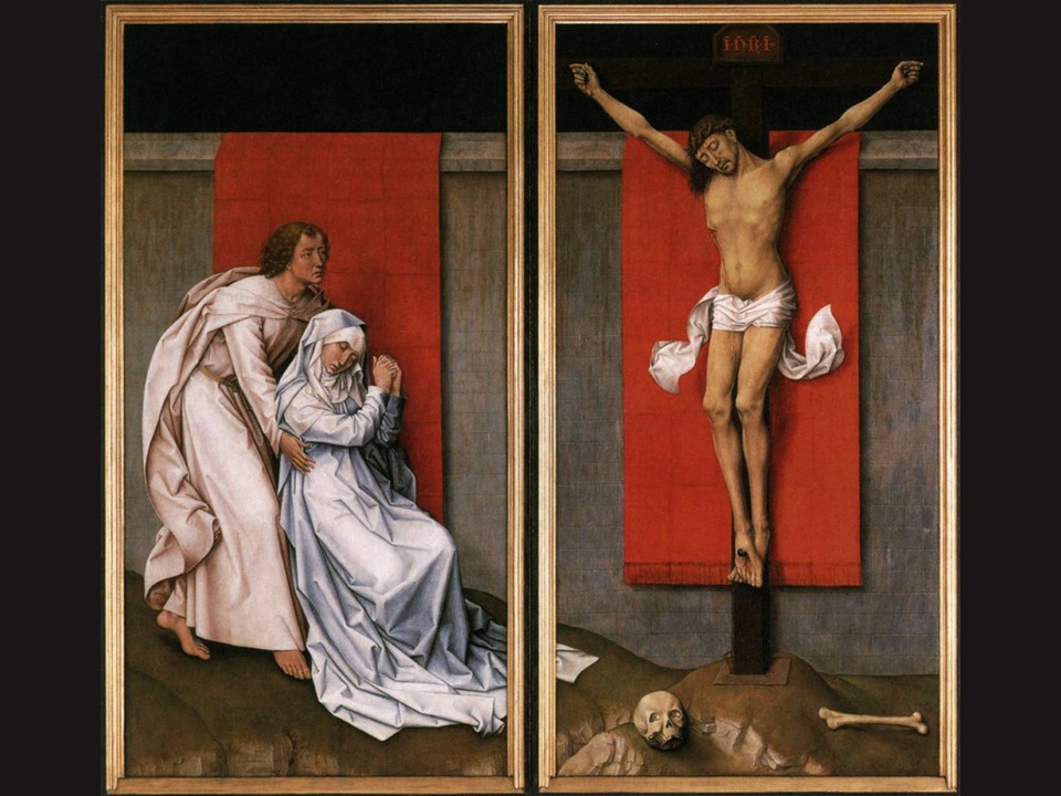
Crucifixion Diptych, c. 1460, oil on oak panels. Left panel: 180.3 × 93.8 cm – Right panel: 180.3 × 92.6 cm, Philadelphia Museum of Art
“My God, My God, why have you forsaken me?” the first thing that comes to my mind when I see Rogier van der Weyden’s Philadelphia Crucifixion!
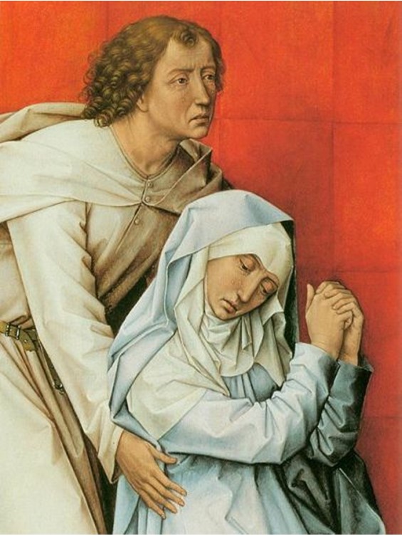
Spiritual, innovative, intense, unique, sophisticated… here are some adjectives I can use to describe this very special Diptych, the great master of Northern Renaissance, Rogier van der Weyden, created back in 1460. Painted with vibrant colours, warm and engaging in some parts, but equally cool and standing apart, in others, Rogier’s colours create an atmosphere of poise, composure and utter sorrow. The two panels are quite distinct, as the right one, heavenly and unearthly, is dedicated to Christ’s greatest moment of Sacrifice, and the left, depicting Saint John the Evangelist supporting a devastated Mary, grounds us to human reality. Yet, the two panels unite through homogeneity in the background, and Mary’s tunic that trails from left to right, creating together, a unique composition.
Not only so… as the Philadelphia Crucifixion, his finest, in my humble opinion, masterpiece, proves Rogier to be the master conductor of a symphony in lines, shapes and glorious colours.
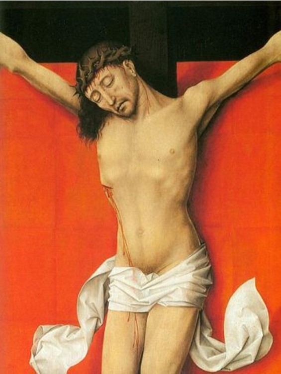
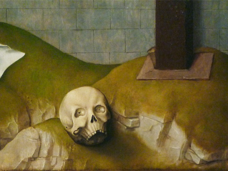
Just observe how masterfully he uses straight, vertical and curved lines… Bold straight lines mark the cornice of the background wall and highlight the face of Christ. The vertical lines of the cross and Christ’s body enhance the necessary need for monumentality and stability, while the outstretched and crossed hands add to Christ’s Pathos. Curved lines observe the postures of both figures on the left panel, John and Mary, adding emotional warmth and humanity. Finally, an imaginary diagonal line, pulls us towards the lower part of the right, Crucifixion panel, emphasizing the meaning of Christ’s Sacrifice on the Cross with the depiction of “Adam’s” Skull on the hill of Golgotha.
Equally important to consider are the shapes Rogier incorporates in his composition and the colours of his palette. The highlight, similarly important in both panels, is undoubtedly the use of two vivid red rectangular pieces of cloth hanging over the background wall, creating the ideal setting for the three protagonists of this amazing Crucifixion. While the hanging cloth is painted a vivid red, the garments the three figures in the composition wear, bathed in stark light, are the palest, crispiest tints the artist could use.
The meaning of this composition is complex. The way these amazing panels were used is equally perplexing… The following Bibliography might help…
Mark S. Tucker, from the Philadelphia Museum of Art: Handbook. Philadelphia: Philadelphia Museum of Art, 2014, pp. 98–99. http://www.philamuseum.org/collections/permanent/102845.html and https://www.facebook.com/rvdweyden/posts/crucifixion-diptych-the-crucifixion-with-the-virgin-and-saint-john-the-evangelis/10162026910315231/
Dr. Christopher D.M. Atkins and Dr. Beth Harris, “Rogier van der Weyden, The Crucifixion, with the Virgin and Saint John the Evangelist Mourning,” in Smarthistory, June 20, 2018, accessed April 15, 2020… https://smarthistory.org/rogier-van-der-weyden-the-crucifixion-with-the-virgin-and-saint-john-the-evangelist-mourning/
The Wikipedia site on Rogier’s PhiladelphiaCrucifixion is interesting and rich… https://en.wikipedia.org/wiki/Crucifixion_Diptych_(van_der_Weyden)
For a Student Activity on the discussed Diptych, please… click HERE!