Georgia O’Keeffe, Pink Sweet Peas II: Close-up view of enlarged pink sweet pea blossoms filling the vertical composition, their velvety petals unfolding in soft gradations of rose against a muted background.

Pink Sweet Peas II

Georgia O’Keeffe, Pink Sweet Peas II: Close-up view of enlarged pink sweet pea blossoms filling the vertical composition, their velvety petals unfolding in soft gradations of rose against a muted background.
Georgia O’Keeffe, American, 1887-1986
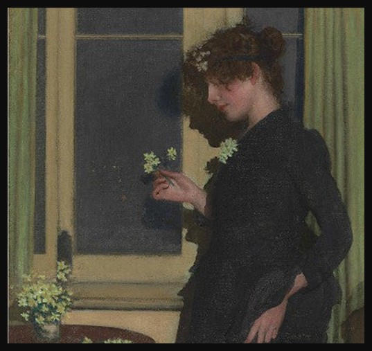
Pink sweet peas II, 1940, Oil on Canvas; 101.6×76.3 cm, Private collection
https://www.facebook.com/photo/?fbid=10162953797243474&set=g.5907271979

In 1940, Georgia O’Keeffe painted Pink Sweet Peas II, a luminous oil on canvas that transforms a modest garden flower into a commanding, almost immersive presence. By enlarging the blossoms to fill the vertical format, O’Keeffe dissolves the boundary between botanical study and abstraction. The petals curve and fold across the surface in soft gradations of pink, their velvety forms emerging from a subdued ground. What might have been a simple still life becomes instead an encounter, intimate, contemplative, and quietly monumental.

Born in 1887 in Sun Prairie, Wisconsin, O’Keeffe emerged as one of the most distinctive voices in twentieth-century American art. After studying at the Art Institute of Chicago and later in New York, she developed an independent visual language rooted in clarity of form and emotional intensity. Her early abstractions attracted the attention of photographer and gallerist Alfred Stieglitz, who became both her advocate and husband. Over the decades, O’Keeffe divided her time between New York and New Mexico, where the vast desert landscape profoundly shaped her artistic vision. Today, she is widely recognized as a central figure in American modernism, celebrated for her radical close-up flowers, stark landscapes, and enduring commitment to seeing the world on her own terms.

O’Keeffe’s flower paintings have long occupied a central place in discussions of American modernism. Working against the conventions of traditional floral still life, she magnified her subjects to such a scale that they verge on landscape. The viewer no longer observes the flower from a polite distance; we are drawn into its interior rhythms. In Pink Sweet Peas II, the gentle chromatic transitions—blush pinks, pale whites, subtle greens—suggest fragility, yet the composition itself feels structurally assured. The sweeping arcs of the petals create a dynamic movement that anchors the painting firmly within modernist concerns for form, color, and spatial tension.

Sweet peas, known for their delicate fragrance and climbing tendrils, carry symbolic associations of blissful pleasure, gratitude, and departure. Their ephemeral bloom makes them a poignant emblem of spring’s brief splendor. That this painting resonates especially in April—often celebrated as Sweet Pea month—adds another layer of meaning. April marks a seasonal threshold: the reawakening of gardens, the return of light, the quiet promise of renewal. O’Keeffe’s magnified blossoms capture that moment of emergence, when growth feels both tender and inevitable.

Yet beyond symbolism, Pink Sweet Peas II speaks to O’Keeffe’s sustained investigation of perception itself. By isolating and enlarging the flower, she compels us to look slowly and attentively. The painting asks what happens when we truly see something ordinarily overlooked. In this way, the work embodies a distinctly modern sensibility, one that values direct experience over inherited convention.

As we celebrate sweet peas in April, O’Keeffe’s canvas offers a reminder that even the most delicate forms can hold immense visual power. Through her brush, a fleeting bloom becomes enduring, and the quiet poetry of spring is translated into color, curve, and light.

For a PowerPoint Presentation, titled ‘2026 – 12 Months – 12 Flowers’, please… Click HERE!

Bibliography: the Georgia O’Keeffe Museum https://www.okeeffemuseum.org/ and https://www.artchive.com/artwork/pink-sweet-peas-2-georgia-o-keeffe/?utm_source=chatgpt.com

Philip Wilson Steer, Jonquil, British Impressionist interior with flowers

Philip Wilson Steer’s Jonquil

March marks the quiet turning of the year, when winter light begins to soften and the first flowers appear almost shyly in gardens and hedgerows. For this month’s Flower of the Month, Philip Wilson Steer’s Jonquil offers a fitting celebration of early spring. The jonquil, long associated with renewal, modest joy, and the promise of warmer days, emerges here not as a botanical study, but as a moment of looking: intimate, fleeting, and tender. Steer, a leading figure in British Impressionism, was deeply attuned to atmosphere and seasonal change, and this small floral subject allows his sensitivity to come fully into focus.

Atmosphere, Light, and Everyday Beauty in Steer’s Work

Philip Wilson Steer (1860–1942) was born in Birkenhead and trained initially at the Gloucester School of Art before continuing his studies at the South Kensington School of Art in London. He later travelled to Paris, enrolling at the Académie Julian, where he encountered French Impressionist and Realist painting at first hand. This exposure proved formative. On his return to Britain, Steer became a central figure in the development of modern British painting, helping to introduce Impressionist approaches to colour, light, and natural observation. In 1886 he was a founding member of the New English Art Club, which offered an important alternative to the academic traditions of the Royal Academy. Steer went on to enjoy considerable professional success, exhibiting widely and later serving as an influential teacher at the Slade School of Fine Art, where he shaped a generation of British artists.

Steer’s aesthetic was grounded in close observation and a deep responsiveness to light and atmosphere. Rather than dramatic narratives or grand historical themes, he gravitated toward moments of quiet presence: coastal landscapes, figures absorbed in thought, and flowers encountered at close range. His brushwork often dissolves form at the edges, allowing light to become an active presence within the composition. Colour is handled with restraint and subtlety, creating a sense of harmony rather than contrast. This sensitivity gives his paintings a reflective quality, as if the viewer is invited to share in the artist’s own act of looking.

As a leading figure in British Impressionism, Steer played a crucial role in adapting continental ideas to the British landscape and temperament. While influenced by French Impressionists, his work remains distinctively measured and introspective, favouring mood over spectacle. Nature, for Steer, was not something to be mastered or idealised, but quietly attended to, whether in the shifting light of a shoreline or the modest presence of a single flower. His interest in everyday subjects reflects a belief that beauty resides in the ordinary, revealed through patience, attentiveness, and an openness to fleeting sensory experience.

Jonquil and the Spirit of Early Spring

Philip Wilson Steer’s Jonquil depicts a young woman standing in profile beside a tall window, absorbed in the quiet act of holding and examining a small spray of pale flowers. She is dressed in a dark, simple garment that contrasts gently with the soft yellows and greens of the interior setting. The window behind her admits a cool, diffused light, which falls across her face and hands, modelling her features with subtlety rather than clarity. A small table or ledge in the foreground holds additional blossoms, echoing the flowers in her hand and reinforcing the intimacy of the scene. The setting feels domestic and enclosed, yet permeated by light, creating a sense of stillness and inwardness.

Philip Wilson Steer, Jonquil, British Impressionist interior with flowers, a drawing
Philip Wilson Steer, English, 1860-1942
Jonquil, 1890, Pen; Ink; Card, 17.7 cm x 17.8 cm, National Museums, Liverpool
https://www.liverpoolmuseums.org.uk/artifact/jonquil

Steer’s aesthetics here are defined by restraint, atmosphere, and emotional understatement. The palette is carefully harmonised: muted yellows, soft greens, deep blues, and warm neutrals are balanced so that no single element asserts dominance. Brushwork is delicate and softened, particularly in the figure and background, allowing forms to merge gently with their surroundings. Light functions not as a dramatic spotlight but as an enveloping presence, dissolving edges and lending the scene a hushed, contemplative mood. The woman’s absorbed pose and the modest scale of the flowers suggest an interest in private, everyday experience rather than narrative or symbolism. Rather than sharply observing the flowers or the figure, Steer seems to suggest them emotionally, capturing a fleeting moment of quiet attention, where nature and human presence meet in a shared atmosphere of calm reflection.

In Jonquil, Steer offers not a celebration of the flower’s brightness, but a meditation on attentiveness itself. The painting’s quiet harmony of light, colour, and gesture invites the viewer to slow down and share in a moment of private contemplation, where the simple act of holding a flower becomes a reflection on season, presence, and renewal. As a work chosen for March, Jonquil gently captures the spirit of early spring—modest, inward, and full of promise.

For a PowerPoint Presentation, of Philip Wilson Steer’s oeuvre, please… Check HERE!

Bibliography: From the Walker Art Gallery https://www.liverpoolmuseums.org.uk/walker-art-gallery and from Sotheby’s https://www.sothebys.com/en/auctions/ecatalogue/2006/20th-century-british-art-l06141/lot.7.html

A Japanese woodblock print of a blue and rust-colored kingfisher perched on a curved iris leaf, its long beak pointing downward. Tall blue irises and pink wild carnations grow against a pale beige background, with black calligraphy and red seals adding balance to the calm, natural scene.

Iris celebrated as the flower of February

A Japanese woodblock print of a blue and rust-colored kingfisher perched on a curved iris leaf, its long beak pointing downward. Tall blue irises and pink wild carnations grow against a pale beige background, with black calligraphy and red seals adding balance to the calm, natural scene.
Katsushika Hokusai, 1760-1849
Kingfisher, Irises and Wild Pinks, ca. 1834, Woodblock Print, 22.9×16.5cm, Victoria&Albert Museum, London, UK
https://collections.vam.ac.uk/item/O71685/kingfisher-irises-and-wild-pinks-woodblock-print-katsushika-hokusai/

Katsushika Hokusai is best known for iconic landscapes like The Great Wave, yet some of his most enchanting works are found in the quieter world of kacho-ga, his bird-and-flower prints. In this article, Facts You Didn’t Know About Hokusai’s Kingfisher, Irises, Wild Pinks, we look closely at a print that blends poetry, nature, and craftsmanship. This elegant composition captures a kingfisher mid-dive among irises and wild pinks — a scene rich with seasonal symbolism and Edo-period artistry. And with the Iris celebrated as the flower of February, it becomes the perfect artwork to explore at this time of year.

Fact 1 — It Belongs to Hokusai’s Celebrated Kacho-ga Tradition

Hokusai’s kacho-ga (“bird and flower pictures”) reveal his sensitivity to nature and his mastery of balance, rhythm, and line. During the Edo period, these prints were extremely popular, decorating homes, shops, and teahouses. They were typically designed in chuban or horizontal oban format, compact sizes that suited domestic interiors.
In Kingfisher, Irises and Wild Pinks, Hokusai combines delicate floral forms with the dynamic motion of a kingfisher swooping toward unseen water below. The serene composition, paired with luminous color, highlights Hokusai’s talent for capturing both the emotional and symbolic qualities of the natural world.

Fact 2 — The Iris Connects the Print to the Month of February

Seasonal references were deeply embedded in Japanese art, literature, and daily life. Flowers signaled not only the time of year but also moods, festivals, and poetic associations. In this print, the Iris, with its upright stance and sword-like leaves, serves as a visual cue for February, a month linked to purification and the transition toward spring. For Edo-period viewers, this seasonal symbolism would have been instantly recognizable. The inclusion of a poem, placed alongside the image, further enriches the association by weaving nature, emotion, and time together in a single frame. Through such details, Hokusai invites viewers to read the artwork as both a botanical study and a meditation on seasonal harmony.

Fact 3 — It Was Created through a highly Collaborative Process

While we often imagine the artist as a solitary genius, Edo woodblock prints were the result of a sophisticated system of collaboration.

  • Hokusai, the designer, created the initial drawing.
  • Block cutters carved the artist’s lines into cherry wood blocks, one for each color.
  • Printers skillfully applied pigments and pressure to produce crisp impressions.
  • Specialist publishers managed the entire operation — financing the work, coordinating artisans, ensuring censorship approval, and distributing the finished prints.

This print bears Hokusai’s signature and includes both the official censor’s seal and the publisher’s mark, confirming its place within a well-regulated marketplace. Far from being unique, each impression was part of a larger production run, making these prints accessible and affordable to a growing urban audience.

Fact 4 — It Was Mass-Produced Yet Considered Highly Refined Art

In the 18th and 19th centuries, prints like this were widely purchased by merchants and artisans who sought beautiful yet affordable decoration. Bird-and-flower prints, in particular, appealed to the tastes of the urban middle class, offering vibrant color and intimate natural imagery. When these prints began arriving in Europe in the mid-to-late 19th century, they were initially seen as inexpensive curios. That changed quickly. Western artists, from the Impressionists to the Arts and Crafts designers, were captivated by the clarity of line, asymmetrical compositions, and expressive patterning. Prices rose dramatically, and Hokusai emerged as the most admired Japanese printmaker in the West. Thus, although Kingfisher, Irises and Wild Pinks was once an accessible decorative print, it is now recognized as a work of remarkable aesthetic refinement.

Fact 5 — Its Influence Reached Victorian Britain and Beyond

Hokusai’s natural imagery had a profound impact on 19th-century British visual culture. Designers and artists were drawn to the flattened perspectives, bold contours, and poetic pairing of flora and fauna. Japanese prints influenced wallpaper design, textile patterns, book illustration, and even garden aesthetics. A print like Kingfisher, Irises and Wild Pinks — combining botanical elegance with calligraphic fluidity — exemplified the qualities Western artists admired most. Through the movement known as Japonisme, Hokusai’s vision helped reshape how Europeans understood nature, composition, and decoration. His influence remains visible today in everything from contemporary illustration to modern graphic design.

Conclusion

Hokusai’s Kingfisher, Irises and Wild Pinks is far more than a charming nature scene. It is a window into the cultural rhythms of Edo Japan, a record of artistic collaboration, and a powerful example of how Japanese aesthetics transformed Western art. With its February irises, dynamic kingfisher, and subtle poetic layers, the print continues to speak across cultures and centuries, proof of Hokusai’s extraordinary ability to turn a moment in nature into a timeless work of art.

For a PowerPoint Presentation of Hokusai’s ‘Masterpieces of Flowers and Birds’, please… Check HERE!

Bibliography: from the Victoria and Albert Museum https://collections.vam.ac.uk/item/O71685/kingfisher-irises-and-wild-pinks-woodblock-print-katsushika-hokusai/

Color lithograph trade card depicting a white snowdrop flower (Galanthus nivalis) with green leaves, from the Flowers series for Old Judge Cigarettes, published by Goodwin & Company in 1890.

The Snowdrop (Galanthus nivalis)

Color lithograph trade card depicting a white snowdrop flower (Galanthus nivalis) with green leaves, from the Flowers series for Old Judge Cigarettes, published by Goodwin & Company in 1890.
Publisher: Issued by Goodwin & Company – Printer: George S. Harris & Sons (American, Philadelphia)
Snowdrop (Galanthus Nivalis), from the Flowers series for Old Judge Cigarettes,
1890, Commercial color lithograph, 7 x 3.8 cm, the MET, NY, USA
https://www.metmuseum.org/art/collection/search/400559

As a new year begins, quiet and unassuming, the snowdrop is the first to brave the frost. Its pale, nodding blooms pierce the frozen ground, a tender symbol of endurance and renewal. For the start of The Flowers of the Months series, I begin with this delicate herald of January — the Snowdrop (Galanthus nivalis) — as depicted in the late nineteenth-century Old Judge Cigarettes “Flowers” series, now part of the Metropolitan Museum of Art’s collection. This post opens The Flowers of the Months series, a year-long exploration of seasonal blooms as they appear in art, history, and material culture.

These small, chromolithographed cards once came tucked inside cigarette packets, blending commerce and culture in the most unexpected way. Produced by Goodwin & Company in New York, a pioneering tobacco firm active in the late nineteenth century, the Old Judge cards were among the earliest and most artful examples of American advertising ephemera. Founded by George Goodwin, the company was known not only for its popular Old Judge and Gypsy Queen brands but also for its innovative use of collectible trade cards to attract and educate consumers.

The Old Judge cards were more than advertisements; they were miniature works of art. Each one celebrated nature’s beauty through careful color and line, transforming a simple collectible into a pocket-sized lesson in botany and aesthetics. The Snowdrop card captures this perfectly — its soft whites and greens rendered against a wintry blue sky, as if whispering of spring to come.

The Snowdrop itself, Galanthus nivalis, takes its name from the Greek for “milk flower” and the Latin for “of the snow.” Native to Europe and naturalized widely across northern lands, it is among the earliest bulbs to bloom each year. Appearing in January, sometimes through frost and snow, the snowdrop’s slender stems and white petals speak of resilience — fragile in appearance but determined in spirit.

In the language of flowers, beloved in the Victorian era when this card was printed, snowdrops carried meanings of hope, purity, and the promise of renewal. They were tokens of consolation and beginnings — the first sign that light would soon return after the long winter nights. In literature, too, they appear as symbols of endurance and gentle courage. To hold a snowdrop is to hold a small promise: that beauty persists even in hardship.

The Old Judge “Flowers” series reminds us that art and advertising have long been intertwined, teaching and delighting in equal measure. Each card, now preserved in museum collections, connects us to a moment when art found its way into everyday life — not on gallery walls, but in the hands of ordinary people. Through these small images, the love of flowers, seasons, and symbolism bloomed anew.

As January unfolds, the Snowdrop invites us to begin softly, to find strength in quiet persistence, and to look forward to the gentle unfolding of the year ahead.

For a PowerPoint Presentation, titled ‘2026 – 12 Months – 12 Flowers’, please… Click HERE!

Bibliography: from the Metropolitan Museum of Art in New York https://www.metmuseum.org/art/collection/search/400559

Andy Warhol’s Kiku Prints

Andy Warhol (American, 1928–1987)
Kiku, 1983 — Screenprint, 50 × 66 cm | Private Collection
Kiku, 1983 — Screenprint, 48 × 66 cm | Private Collection
Kiku, 1983 — Screenprint, 50 × 66 cm | Private Collection
Shapero Modern, London, UK https://news.artnet.com/art-world/spotlight-andy-warhol-chrysanthemum-prints-1991310

November brings the chrysanthemum, recognized in floral tradition as the flower of the month and long celebrated in art and poetry. Matsuo Bashō (1644–1694) captured its quiet beauty in his haiku: Chrysanthemums bloom— / the scent of old age / in the autumn dusk. More than three centuries later, Andy Warhol’s Kiku prints reimagine this iconic flower. In his series of three prints, he transforms the traditional symbol of autumnal reflection into a vibrant, modern meditation on color, repetition, and the persistence of life and memory. Warhol’s chrysanthemums echo the seasonal beauty that Bashō so delicately observed, bridging centuries of artistic contemplation around a single, enduring motif.

In 1983, Warhol was commissioned by Fujio Watanuki, a prominent figure in the Japanese avant-garde and founder of the Gendai Hanga Center in Tokyo, to create a series inspired by the chrysanthemum, or kiku in Japanese. This collaboration marked a significant intersection of Eastern and Western artistic sensibilities. Having previously visited Japan in 1956 and 1974, Warhol was invited to produce a body of work that resonated with Japanese culture, particularly focusing on flowers. The resulting Kiku series comprises three screenprints, each depicting the chrysanthemum in Warhol’s signature pop art style. Unusually small in scale, the prints echo the intimate proportions of Japanese hanging scrolls and screens. Warhol’s screenprinting technique involved layering vibrant colors onto Rives BFK paper, creating dynamic compositions that blend traditional Japanese motifs with his bold, graphic abstraction.

https://news.artnet.com/art-world/spotlight-andy-warhol-chrysanthemum-prints-1991310

Aesthetically, the Kiku prints are a striking fusion of delicate natural imagery and Warhol’s vibrant, modernist approach. Through the use of contrasting colors and layered repetition, the chrysanthemums are transformed into a visual rhythm that is both meditative and contemporary. Each print balances the flower’s elegance with the intensity of modern design, celebrating the chrysanthemum not merely as a botanical subject but as a symbol of cultural exchange, bridging centuries of artistic tradition from Japan to the Western pop art world.

The original prints created for Watanuki are part of a limited edition and are now held in private collections and select galleries worldwide. While not permanently on public display, they occasionally appear in exhibitions and auctions, offering glimpses into Warhol’s engagement with Japanese culture. Institutions such as the Gendai Hanga Center in Tokyo and galleries specializing in Warhol’s work may provide opportunities to experience these intimate yet powerful prints firsthand.

The chrysanthemum holds a special place in Japanese culture as the quintessential flower of autumn, symbolizing longevity, rejuvenation, and the quiet beauty of the season. Its bloom coincides with the cooling of the year, making it a central motif in art, poetry, and seasonal celebrations such as the Chōyō no Sekku (Festival of the Double Ninth) in September. In the West, the chrysanthemum was adopted into the floral calendar as the flower of November, representing respect, honor, and the transitional beauty of late autumn. This cross-cultural recognition highlights the universal appeal of the chrysanthemum’s form and symbolism, linking the seasonal reflections captured in Bashō’s haiku to the modern reinterpretation found in Warhol’s Kiku prints.

Matsuo Bashō (1644–1694) is considered the greatest master of Japanese haiku. He lived during the Edo period and elevated the short poem from a playful literary pastime into a deeply expressive art form. Bashō was born Matsuo Kinsaku in Ueno (now Iga, Japan) and trained in both classical Chinese and Japanese poetry before dedicating himself to haikai (the predecessor of haiku). He lived much of his life as a wandering poet, traveling through Japan on long journeys that inspired his most famous works, such as The Narrow Road to the Deep North (Oku no Hosomichi). His haiku often capture fleeting natural scenes, a frog jumping into an old pond, the sound of cicadas, the stillness of autumn evenings, with profound simplicity. He combined Zen Buddhist awareness, classical elegance, and keen observation of everyday life, making haiku both deeply spiritual and accessible.

For a Student Activity inspired by Andy Warhol’s prints oh Kiku, please… Check HERE!

Bibliography: https://news.artnet.com/art-world/spotlight-andy-warhol-chrysanthemum-prints-1991310 and https://www.poetryfoundation.org/poets/basho

Morning Glories by Suzuki Kiitsu

Morning Glories by Suzuki Kiitsu, Japanese Edo period artist (1796–1858), six-panel folding screens with ink, color, and gold leaf on paper, The Met Museum, New York, USA
https://www.metmuseum.org/art/collection/search/48982

Morning Glories by Suzuki Kiitsu, a stunning pair of early 19th-century six-panel folding screens housed in The Met, exemplifies the lyrical elegance of the Rinpa school. Against a backdrop of luminous gold leaf, the Morning Glory vines unfurl in rhythmic cascades, their delicate blooms appearing both vibrant and contemplative. Kiitsu’s masterful use of space, color, and pattern invites a meditative gaze, blurring the boundary between nature and design. The screens evoke a quiet moment suspended in time, one that inspired the haiku: Bound in gilded calm, / the morning glories whisper / secrets to the sun. Through this intricate dialogue between natural form and artistic restraint, Kiitsu offers more than decorative beauty, he captures the ephemeral grace of a single September morning made eternal.

Suzuki Kiitsu was a prominent Japanese painter of the Edo period and a leading figure of the Rinpa school of painting. Born in Edo, modern-day Tokyo, Kiitsu was a devoted student of Sakai Hōitsu, who revived and expanded the decorative Rinpa tradition established by artists like Ogata Kōrin and Tawaraya Sōtatsu. After Hōitsu’s death, Kiitsu continued his teacher’s legacy while developing a distinct personal style. He became known for his screen paintings and nature studies that combined bold design with subtle naturalism. Despite being less internationally known than his predecessors, Kiitsu is celebrated in Japan for refining the Rinpa aesthetic with a fresh sensitivity and technical finesse.

Kiitsu’s work is characterized by luminous color, rhythmic composition, and a heightened attention to seasonal motifs such as flowers, birds, and flowing water. His celebrated screen paintings, including Morning Glories, demonstrate his skill in transforming natural subjects into elegant, almost abstract patterns while maintaining a sense of stillness and harmony. He often employed gold or silver leaf backgrounds, setting ephemeral flora against timeless, radiant fields, a hallmark of Rinpa visual poetry. Kiitsu’s legacy rests in his ability to balance reverence for tradition with individual innovation, securing his place as a master of Japanese decorative painting.

The Rinpa school of art, sometimes spelled Rimpa, originated in early 17th-century Kyoto and is one of the most influential styles in traditional Japanese painting. It began with Tawaraya Sōtatsu, who was known for his elegant, stylized depictions of classical literature and nature, often painted on folding screens and fans. A century later, Ogata Kōrin revitalized the style, blending Sōtatsu’s decorative sensibility with a more dramatic use of color, form, and rhythm. Rinpa artists were not part of a formal lineage but were connected by shared aesthetic values, including the use of gold or silver leaf backgrounds, flattened perspective, and an emphasis on seasonal or poetic themes drawn from classical Japanese literature and waka poetry.

The term “Rinpa” itself combines “Rin” from Kōrin and “pa”, meaning “school”, coined much later to describe this loosely associated group of artists. Rinpa works often merge painting, calligraphy, and design, revealing a sophisticated balance between abstraction and representation. While the style was deeply rooted in Japanese tradition, it also showed openness to Chinese and Korean influences in brushwork and composition. Suzuki Kiitsu, working two centuries later, was part of a later Edo-period revival of Rinpa led by Sakai Hōitsu. Though removed in time, Kiitsu embraced and expanded Rinpa’s visual language, ensuring its continued vitality and influence into the modern era.

Morning Glories is a monumental pair of six‑panel folding screens, a byōbu, crafted with ink, color, and gold leaf on paper. The work creates a vivid, expansive field in which rich blues and greens of Morning Glory blossoms emerge from a radiant gold-leaf ground. Kiitsu omits any spatial context or background elements, concentrating instead on the lush proliferation of flowers and leaves. The blossoms on the right screen rise upward from the ground, while those on the left cascade down, as if held by an invisible trellis, a composition that balances exuberance with careful orchestration.

This screen set reflects Kiitsu’s dual influences: trained as a textile dyer and a pupil of Sakai Hōitsu, he skillfully merges decorative pattern sensibility with naturalistic rendering. The thick, mineral pigments against the gold leaf evoke the luxurious surface of textiles, while subtle attention to botanical form ensures each petal and vine feels believable and dynamic. The tension between decorative abstraction and natural realism is characteristic of Rinpa aesthetics, yet in this work Kiitsu brings a fresh vision, his Morning Glories are botanical yet stylized, rhythmic yet alive. As a signature masterpiece of the Edo‑period Rinpa revival, these screens embody both opulent décor and quiet botanical poetry.

As a fitting close to this meditation on Suzuki Kiitsu’s Morning Glories, it is worth noting that the morning glory is the traditional birth flower of October, a symbol of fleeting beauty, affection, and renewal. In Kiitsu’s masterful screens, this humble bloom becomes a grand subject, elevated through shimmering gold and rhythmic composition into something timeless. The flower’s delicate form and brief bloom are captured in suspended motion, embodying both the transience of nature and the elegance of Edo-period design. In this radiant work, Kiitsu not only honors the spirit of the Rinpa school but also transforms a seasonal motif into a lasting celebration of life’s quiet, impermanent grace.

For a Student Activity, inspired by the MET folding screen titled Morning Glories by Suzuki Kiitsu, please… Check HERE!

Bibliography: https://www.metmuseum.org/art/collection/search/48982

Marigolds

Dante Gabriel Rossetti, English, 1828 – 1882
Marigolds or Bower Maiden, 1873, Oil on Canvas, 114.3 x 73.66 cm, Nottingham Castle Museum and Art Gallery, UK https://useum.org/artist/Dante-Gabriel-Rossetti

When Dante Gabriel Rossetti introduced Marigolds (also known as The Bower Maiden) to his patron Frederick Leyland in 1874, he described it as ‘modern and naturalistic,’ portraying ‘a young girl (fair) in a tapestried chamber, with a jar containing marybuds (or marsh marigolds, the earliest spring flowers here), which she is arranging on a shelf. Near her is a cat playing with a ball of worsted.’ Rossetti emphasized that the picture was painted directly from nature, its freshness recalling his Veronica Veronese, and he believed it would be ’a general favourite.’ The marigolds at the heart of the composition, however, reach beyond decorative charm. They resonate with Robert Graves’s lines: ‘Look: the constant marigold / Springs again from hidden roots. / Baffled gardener, you behold / New beginnings and new shoots.’ Just as Graves praises the flower’s irrepressible return, Rossetti’s painting transforms the simple act of arranging spring blossoms into a quiet meditation on renewal, resilience, and the enduring vitality of nature and beauty. https://allpoetry.com/poem/8502277-Marigolds-by-Robert-Graves

The symbolism of the marigolds is crucial to Rossetti’s vision. In Victorian floriography, the flower carried a dual meaning, mourning and sorrow on the one hand, resilience and renewal on the other. Graves captures this duality when he writes, ’Pull or stab or cut or burn, / They will ever yet return.’ The marigold, with its golden bloom emerging each spring, becomes an emblem of endurance in the face of loss, a reminder that life continually pushes back against decay. Rossetti, painting at a time when he himself was burdened by ill health and emotional strain, may have found in the marigold a quiet metaphor for persistence, allowing his art to embody the same cycle of return that Graves’s poem celebrates.

Equally striking is the painting’s sense of domestic immediacy. Rossetti was quick to assure Leyland that Marigolds was ‘modern and naturalistic,’ and indeed, the scene eschews lofty allegory for the intimacy of daily life: a young girl carefully placing blossoms in a vase, a cat playfully tangling with a ball of worsted, the faded richness of tapestried walls. This balance between realism and symbolism reflects Rossetti’s fascination with beauty as both ordinary and transcendent. By anchoring the marigolds within a recognisable domestic setting, he elevates a fleeting household moment into a meditation on permanence, underscoring how even the simplest gestures can carry the weight of renewal.

At the heart of Marigolds is ‘Little Annie,’ the daughter of the Kelmscott Manor gardener, who occasionally assisted in the house. Painted at Kelmscott in the spring of 1873 and finished in early 1874, the work captures Annie in a simple hood typically worn for housework, as she carefully places a vase of marigolds on the mantle shelf in the Green Room. Rossetti gave the painting several titles, The Bower Maiden, Fleur-de-Marie, and The Gardener’s Daughter, each emphasizing the domestic intimacy of the scene. Annie’s youthful poise and attentive gestures transform this ordinary task into a moment of quiet dignity, reinforcing the painting’s themes of care, renewal, and the persistent beauty of life.

This domestic setting also mirrors Rossetti’s own preoccupations during the early 1870s. He was navigating personal and creative challenges, including declining health and emotional strain, and the serene act of arranging marigolds becomes a gentle meditation on resilience. Annie, the flowers, and the Green Room together create a scene where everyday life and symbolic meaning intersect, echoing the same insistence on persistence and return celebrated decades later in Robert Graves’s poem.

Ultimately, Marigolds is a quiet testament to endurance and renewal, where the simplicity of a young girl placing flowers becomes a reflection of nature’s unstoppable vitality. Annie’s gentle presence and attentive gestures, combined with the marigolds’ persistent bloom, embody the cycle of return that Robert Graves later celebrated: ’Pull or stab or cut or burn, / They will ever yet return.’ Rossetti transforms a domestic moment into a meditation on life’s continuity, showing that beauty and resilience thrive even in the most ordinary of acts. In this convergence of naturalism, symbolism, and human care, the painting and the poem together remind us that beginnings, like the marigolds, always reemerge from hidden roots, inviting reflection on the quiet persistence of both nature and the human spirit.

For a PowerPoint Presentation, please… Check HERE!

Bibliography: https://www.christies.com/en/lot/lot-6408804 and https://editions.covecollective.org/content/dante-gabriel-rossetti-marigolds-alternate-titles-bower-maiden-fleurs-de-marie-gardeners

In Poppyland

John Ottis Adams, American Artist, 1851-1927
In Poppyland, 1901, Oil on Canvas, 55.9 x 81.3 cm, David Owsley Museum of Art, Ball State University Art Museum, IN, USA
https://www.bsu.edu/web/museumofart/exhibitions/past#accordion_impressionsoflove

John Ottis Adams’s In Poppyland, housed in the David Owsley Museum of Art captures the lush, dreamlike essence of a summer landscape steeped in both beauty and symbolism. With sweeping fields awash in crimson poppies, Adams evokes the mood of late summer, specifically August, the month associated with the poppy flower, known for its ties to both sleep and remembrance. The visual poetry of the scene finds a perfect echo in Antonio Bertolucci’s evocative verse… This is a year of poppies: our land / was brimming with them as May burned / into June and I returned— / a sweet dark wine that made me drunk. / From clouds of mulberry to grains to grasses / ripeness was all, in the fitting / heat, in the slow drowsiness spreading / through the universe of green… Like the poem, Adams’s painting invites us into a world suspended between wakefulness and reverie, where nature overflows with color, warmth, and memory. https://www.poetryfoundation.org/poetrymagazine/poems/54223/poppies

A prominent American Impressionist painter and key figure in the Hoosier Group, John Ottis Adams (1851–1927) was part of a collective of Indiana-based artists who helped shape Midwestern landscape painting in the late 19th and early 20th centuries. Born in Indiana, Adams studied art in London at the South Kensington School and later in Munich at the Royal Academy of Fine Arts, where he developed a solid foundation in academic realism. His time in Munich was formative, exposing him to rigorous training and a circle of fellow American expatriate artists. Upon returning to the United States, he settled in Indiana, where he dedicated much of his career to capturing the natural beauty of his home state. Adams was not only a painter but also a passionate educator, co-founding the Herron School of Art in Indianapolis and influencing generations of young American artists. He was married to Winifred Brady Adams, an accomplished still-life and portrait painter, and their shared artistic vision helped foster a creative environment that extended from their personal lives to the broader Indiana art community.

Aesthetically, Adams embraced a style that blended academic technique with Impressionist sensibilities, using light and color to evoke mood and atmosphere rather than strict realism. His landscapes often feature quiet riverbanks, pastoral meadows, and changing skies, rendered with loose, expressive brushwork and a harmonious palette that reflect his deep appreciation for nature’s subtleties. Adams’s compositions favor balance and serenity, drawing the viewer into meditative encounters with the natural world. In paintings like In Poppyland, he captured not just the visual essence of a place but its emotional resonance—offering scenes that feel both immediate and timeless, rooted in observation but elevated by poetic interpretation.

The painting In Poppyland is a luminous celebration of the American landscape, blending Impressionist technique with a deep, personal connection to nature. It presents a vivid field of blooming poppies under a bright summer sky, rendered with loose, expressive brushwork and a vibrant palette of reds, greens, and soft blues. Adams captures not only the visual richness of the scene but also its atmosphere, warm, drowsy, and gently swaying with life, inviting viewers into a moment of seasonal abundance and reverie. Created during a period when Adams spent time painting in rural Indiana and abroad, In Poppyland reflects both his European training and his commitment to elevating the native Midwest as a worthy subject of high art. The composition’s gentle rhythm and immersive color evoke a sense of timeless beauty, where nature’s quiet grandeur speaks through light, texture, and mood.

Poppies have always held a special kind of magic, bright, delicate, and full of meaning. In ancient Greek and Roman myths, they symbolized sleep, dreams, and even remembrance, and their vivid presence has continued to inspire artists through the ages. Adams’s In Poppyland, brings that symbolism to life in a way that feels both timeless and deeply personal. The painting draws us into a peaceful summer moment, filled with warmth, color, and quiet reflection. It reminds us how nature can speak to the heart, and how something as simple as a field of flowers can carry stories, memories, and beauty that stay with us long after we’ve looked away.

For a PowerPoint Presentation on John Ottis Adams’s oeuvre, please… Check HERE!

Bibliography: https://www.bsu.edu/web/museumofart/exhibitions/past#accordion_summer2019 and https://artsandculture.google.com/entity/john-ottis-adams/m0276lmv?hl=en

Henri Emile Benoît Matisse's painting depicting Daisies.

Daisies by Henri Matisse

Henri Emile Benoît Matisse's painting depicting Daisies.
Henri Emile Benoît Matisse, French Artist, 1869-1954
Daisies, 1939, Oil on Canvas, 92 × 65 cm, The Art Institute of Chicago, USA https://www.artic.edu/artworks/100226/daisies

The painting Daisies by Henri Matisse, housed in The Art Institute of Chicago, captures the quiet radiance of nature with his signature bold colours and fluid brushwork. The daisy, the flower of April, symbolizes purity, resilience, and new beginnings—qualities that resonate deeply in Matisse’s luminous arrangement of white blossoms against a vibrant backdrop. His depiction calls to mind Emily Dickinson’s tender lines: “The daisy follows soft the sun, / And when his golden walk is done, / Sits shyly at his feet. / He, waking, finds the flower near. / ‘Wherefore, marauder, art thou here?’ / ‘Because, sir, love is sweet!’” Like Dickinson’s poetic daisy, Matisse’s flowers seem to bask in an unseen glow, embodying an intimate conversation between light and form, simplicity and devotion. https://discoverpoetry.com/poems/daisy-poems/

Matisse’s Daisies, is a joyful still-life that captures his fascination with colour, light, and organic forms. The painting presents a bouquet of white daisies arranged in a transparent glass vase, set against a stark black background and ‘accompanied’ by the artist’s model, seated on a bright red chair, outlined with thick, fluid, black lines, as well as a pink-and-blue drawing of another woman on the upper left side of the painting. The vase of Daisies is part of a Still Life arrangement organized on the right side of the painting. It consists of a green amphora, a vase of flowers, and lemons atop a tall light-blue table. Matisse employs bold brushstrokes, layering warm yellows, deep reds, and rich greens that contrast with the crisp white petals of the daisies. Though simply rendered, the flowers exude an unmistakable vibrancy, as if swaying gently in an unseen breeze. The composition balances structure and fluidity—while the vase anchors the scene, the blossoms extend outward, softly blending into the surrounding space.

Aesthetically, Daisies exemplifies what Matisse called “ballast,” a technique of adding and removing paint to achieve the desired effect of light. Rather than aiming for photographic realism, he distills the essence of the subject through bold contours and a dynamic interplay of warm and cool hues. The daisy—a flower often associated with innocence and renewal—becomes a vehicle for Matisse’s exploration of harmony, light, and movement. The painting’s flattened perspective and luminous palette reflect his belief in art’s ability to evoke joy and emotional depth rather than mere representation. The background, composed of dappled brushstrokes in yellow and red, creates a sense of warmth and intimacy, drawing the viewer into a world where nature and art converge in pure, expressive beauty.

Photograph of Reichsmarschall Hermann Göring in front of Henri Matisse's painting.
Paris, 2nd December 1942
At the Jeu de Paume Museum, Reichsmarschall Hermann Göring, painting in his left hand and cigar in his right, sits gazing at two works by Henri Matisse being supported by Bruno Lohse. Standing to Göring’s left is his art advisor, Walter Andreas Hofer. Note the bottle of champagne on the table. Both paintings were stolen from the Paul Rosenberg collection by the Nazis and were recovered and returned after the war. The painting on the left, ‘Marguerites’, today hangs in the Art Institute of Chicago. The other, ‘Danseuse au Tambourin’, is at the Norton Simon Museum in Pasadena, California. mage credit: Archives des Musées Nationaux https://artuk.org/discover/stories/art-matters-podcast-the-monuments-men-and-preserving-art-during-war

Created during a pivotal period in Matisse’s career, Daisies was painted in 1939, just as the world teetered on the brink of World War II. Despite the looming global turmoil, Matisse continued to explore the themes of serenity and vitality that defined much of his work. Daisies was initially acquired by the renowned modern art dealer Paul Rosenberg (1881–1959). However, with the Nazi occupation of France, Rosenberg, like many other Jewish dealers, was forced to flee, and his extensive collection, including Daisies, was seized. After World War II, the painting was among the works recovered by the U.S. Army’s efforts to restitute looted art. Rosenberg reclaimed Daisies and brought it to his newly established gallery in New York. Eventually the painting became part of The Art Institute of Chicago’s collection, where it remains a cherished example of Matisse’s lifelong pursuit of beauty through simplified, evocative forms.

Henri Matisse (1869–1954) was a pioneering French artist whose bold use of color and fluid forms reshaped modern art. Initially trained in law, he discovered painting in his early twenties and soon became a leading figure in Fauvism, a movement defined by vibrant, expressive color. Throughout his career, Matisse continuously experimented with composition, perspective, and light, moving from the vivid hues of his Fauvist period to the refined, decorative harmony of his later works. Even as he faced illness in his later years, he adapted his creative process, embracing cut-outs and paper collages as a new medium for artistic expression. His 1939 painting Daisies reflects this lifelong pursuit of joy and balance, distilling nature into a symphony of colour and form. Like much of his work, it transcends simple representation, instead capturing the emotional essence of its subject—transforming an ordinary bouquet into an emblem of vitality and renewal.

Daisies are often associated with April because they symbolize purity, new beginnings, and resilience—qualities that align with the themes of springtime renewal. As one of the first flowers to bloom widely across fields and gardens when winter recedes, daisies represent the fresh start that April brings. Their name comes from the Old English “dæges ēage” (day’s eye), referring to their habit of opening with the sun and closing at night, further reinforcing their connection to the longer, sunlit days of early spring. In floral traditions, the daisy is often linked to innocence, love, and transformation, making it a fitting emblem for a month that bridges the transition from the softer, budding days of March to the full bloom of late spring.

For a Student Activity, inspired by Matisse’s Daisies, please… Check HERE!

Bibliography: https://publications.artic.edu/matisse/reader/works/section/87 and https://www.artic.edu/artworks/100226/daisies

David Hockney's iPad painting The Arrival of Spring, Normandy, 2020, Do Remember They Can't Cancel the Spring.

David Hockney’s Daffodils

David Hockney's iPad painting The Arrival of Spring, Normandy, 2020, Do Remember They Can't Cancel the Spring.
David Hockney, English,born 9 July 1937
The Arrival of Spring, Normandy, 2020, Do Remember They Can’t Cancel the Spring, iPad painting © David Hockney https://www.standard.co.uk/culture/david-hockney-daffodils-spring-coronavirus-lockdown-a4394636.html

As we step into March, we celebrate its arrival with the radiant Daffodil, beautifully captured in David Hockney’s Daffodils, 2020, a standout piece from his series The Arrival of Spring, Normandy, 2020. This artwork embodies the vitality and optimism of spring, as the bright yellow blooms emerge as harbingers of renewal and resilience. Hockney immortalizes the Daffodils with bold colours and a dynamic composition, reflecting his belief in the enduring power of nature, encapsulated in his poignant phrase, Do remember they can’t cancel the Spring.’Together, we’ll explore the ‘who,’ ‘when,’ ‘what,’ ‘why’ and ‘how’ of this artwork, uncovering how it bridges the natural world and artistic expression, inviting us to pause and embrace the beauty of March in full bloom.

David Hockney’s The Arrival of Spring, Normandy, 2020 is a vibrant celebration of renewal and the beauty of the changing seasons, created during the global lockdown. Comprising 116 iPad paintings, the series captures the artist’s observations of the Normandy countryside, where he sought refuge during the pandemic. Hockney masterfully uses his iPad as a digital canvas, bringing a fresh perspective to landscapes with bright colours, bold lines, and a sense of immediacy. Echoing his poignant phrase… Do remember they can’t cancel the Spring, the collection reflects his enduring fascination with nature and the passage of time, offering viewers a sense of hope, resilience, and the simple joys of observing the world around them.

Who is David Hockney? David Hockney is one of the most influential and celebrated British artists of the 20th and 21st centuries, renowned for his innovative approach to art and his exploration of colour, perspective, and technology. Born in Bradford, England, in 1937, Hockney gained international acclaim in the 1960s as a key figure in the Pop Art movement, with works that often reflected his fascination with everyday life, portraiture, and landscapes. Over his prolific career, he has continually reinvented his style and medium, from his iconic California pool paintings to groundbreaking digital works created on iPads. Hockney’s art is deeply personal, yet universal, capturing the joy and beauty of the world around him with a distinctive blend of boldness and warmth, making him a beloved figure in contemporary art.

David Hockney's iPad painting 
The Arrival of Spring, Normandy, 2020, No. 258, 27th April 2020, No. 1
David Hockney, English, born 9 July 1937
The Arrival of Spring, Normandy, 2020, No. 258, 27th April 2020, No. 1, David Hockney. © David Hockney https://www.dreamideamachine.com/?p=81176

When did David Hockney create The Arrival of Spring, Normandy, 2020 series, and what inspired him during that time? David Hockney created The Arrival of Spring, Normandy, 2020 during the early months of the COVID-19 pandemic in 2020 while living in isolation at his farmhouse in Normandy, France. Inspired by the changing seasons and the resilience of nature amidst global uncertainty, the series reflects his deep observation of the renewal and vitality of spring, serving as both a personal meditation and a universal message of hope. Through 116 iPad paintings, Hockney captured the essence of the Normandy countryside, celebrating the enduring beauty of nature during a time of profound disruption. The artist produced all the works in the series en plein air, much like the Impressionists, whose work influenced Hockney both generally and specifically for this series. For example, Monet’s Stacks of Wheat, and Hockney’s The Arrival of Spring explore the interplay of light and color at different times of day and throughout the progression of the season, bringing a dynamic and transformative perspective to his landscapes.

David Hockney;s iPad painting The Arrival of Spring, Normandy, 2020, No. 340, 21st May 2020
David Hockney, English, born 9 July 1937
The Arrival of Spring, Normandy, 2020, No. 340, 21st May 2020, iPad painting © David Hockneyhttps://www.bozar.be/en/watch-read-listen/david-hockney-bozar

Why did Hockney turn to iPad painting for, instead of traditional mediums, and how was it received by audiences? David Hockney turned to iPad painting for The Arrival of Spring, Normandy, 2020 because it allowed him to work swiftly and spontaneously, capturing the fleeting beauty of nature with immediacy and precision. The portability and versatility of the medium enabled him to document the changing seasons in real-time, often completing a piece The Arrival of Spring, Normandy, 2020within hours. Hockney has long embraced new technologies in his art, viewing them as tools to expand creative possibilities. The use of iPad painting in this series was well-received by audiences, who appreciated its modernity and accessibility. Critics praised Hockney’s ability to translate traditional artistic techniques into a digital format while maintaining the vibrancy, detail, and emotional resonance that characterize his work, further solidifying his reputation as a forward-thinking artist.

David Hockney in his Normandy studio with his iPad landscapes.
David Hockney in his Normandy studio with his iPad landscapes © David Hockney
https://www.bozar.be/en/watch-read-listen/david-hockney-bozar

Why does Daffodils, 2020 stand out as a representation of March and how did Hockney incorporate Daffodils in his The Arrival of Spring, Normandy, 2020 series? Daffodils, 2020 stands out as a representation of March because they are often the first signs of spring. The Daffodil is a quintessential symbol of the season, celebrated for its vibrant yellow blooms that herald the end of winter and the renewal of life. In Hockney’s artwork, the Daffodils burst with energy and optimism, reflecting the vitality and hope associated with the transition into spring. Hockney’s use of bold colours and dynamic composition captures the essence of the flower’s cheerful and resilient nature, making it an ideal representation of March—a month characterized by growth, renewal, and the promise of brighter days ahead. Through this piece, Hockney invites viewers to pause and appreciate the simple, uplifting beauty of the natural world.

How is the Daffodil connected to the Greek myth of Narcissus? The Daffodil, botanically known as Narcissus, is intrinsically linked to the Greek myth of Narcissus, the son of the river god Cephissus and the nymph Liriope. According to legend, Narcissus was a youth of extraordinary beauty who became entranced by his own reflection in a pool of water, ultimately leading to his demise. In some versions of the myth, the gods transformed him into the Daffodil flower, which thereafter bore his name. This association imbues the Daffodil with themes of self-love and vanity, as well as the transient nature of beauty. The flower’s early spring bloom further symbolizes rebirth and new beginnings, adding layers of meaning that have been reflected in art and literature throughout history.

For Student Activities inspired by David Hockney’s Daffodils, please… Check HERE!

Bibliography: https://www.artic.edu/articles/1010/10-things-to-know-about-david-hockney-s-the-arrival-of-spring-normandy-2020 and